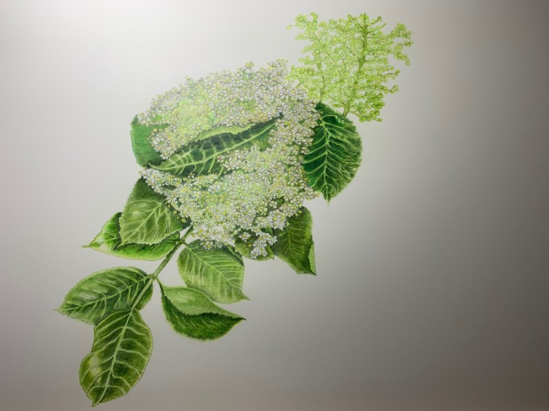
Beautiful, rich greens Theresia! You have done a wonderful job!!!The image is so fresh and crisp!!! The majority of the secondary veins look good, but the veins on the bottom leaf look too thick and uniform. I am thrown by the leaf (?) at the end of the upper flower. It does not have any veins showing and it does not taper to a point like your other leaves. The lower flower cluster is beautiful and has great depth! The cluster above it does not read as well obviously because it does not have the benefit of a total dark green background. Keep that in mind when you are selecting the view you are going to do. Personally, I would add a leaf or two above that flower cluster to showcase it too. I would also alter the end of the leaf I mentioned above. Great job!!!!
Thank you very much, Dough! I am going to correct the painting the way you suggested. Two additional leaves on top will help to frame the flower clusters and let the highlight become more obvious. My concern was the highlight of the flower clusters. I understood that I should see it as a whole „sphere“ and therefore I placed the highlight on the upper left? That’s why this area got a softer toning and less or lighter greens. So considering the flower clusters as one form was right? In autumn I want to add the berries too. Thank you!
This tiny clusters of flowers are so difficult, and you did a really nice job. I love how you used the dark green leaves to make those flowers stand out. You drew the leaves and stem really well, too. I would like to see those secondary veins on the leaves narrowed up just a bit. They look a little too wide and obvious to me. What do you think?
Thank you Pam! I‘m going to do that! Maybe I‘ll get them a bit darker (green) too. Now you mentioned it, I get the idea that it might be the color too. Thank you for your kind advice!
Beautiful, rich greens Theresia! You have done a wonderful job!!!The image is so fresh and crisp!!! The majority of the secondary veins look good, but the veins on the bottom leaf look too thick and uniform. I am thrown by the leaf (?) at the end of the upper flower. It does not have any veins showing and it does not taper to a point like your other leaves. The lower flower cluster is beautiful and has great depth! The cluster above it does not read as well obviously because it does not have the benefit of a total dark green background. Keep that in mind when you are selecting the view you are going to do. Personally, I would add a leaf or two above that flower cluster to showcase it too. I would also alter the end of the leaf I mentioned above. Great job!!!!
Thank you very much, Dough! I am going to correct the painting the way you suggested. Two additional leaves on top will help to frame the flower clusters and let the highlight become more obvious. My concern was the highlight of the flower clusters. I understood that I should see it as a whole „sphere“ and therefore I placed the highlight on the upper left? That’s why this area got a softer toning and less or lighter greens. So considering the flower clusters as one form was right? In autumn I want to add the berries too. Thank you!
Hi Doug, I‘m so sorry I just recognized that I misspelled your name (autocorrection?) I just don’t know. I‘m really sorry! Theresia
This tiny clusters of flowers are so difficult, and you did a really nice job. I love how you used the dark green leaves to make those flowers stand out. You drew the leaves and stem really well, too. I would like to see those secondary veins on the leaves narrowed up just a bit. They look a little too wide and obvious to me. What do you think?
Thank you Pam! I‘m going to do that! Maybe I‘ll get them a bit darker (green) too. Now you mentioned it, I get the idea that it might be the color too. Thank you for your kind advice!
No worries Theresia! I have some friends that actually call me Dough. It struck me at first – how did Theresia know that?!
😅Thank you!