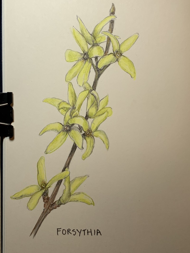
Beautiful Ishbel! There are a couple of spots that I would tone. The bottom right petal and the second one down from the top on the right. The same view and I think the middle petal would be in shadow (at least close to the center). The bottom right petal of that flower (2nd from top) could also use a little more toning. It is a confusing spot because of the petal from the bloom below covers over it? It is such a refreshing page! Great job! Hope all is as good as it can be out by you!
Thanks Doug…I’ll work on it a bit more. Things are not too bad here on my little island…NYC is frightening so glad you guys are in the countryside. Be safe.
01 April 2020
Love this, Ishbel. These are starting to pop out near us, too. 🙂 I am also glad to be in the countryside… glad to hear that you are doing ok out there. My comment on these flowers is that I think it would look nice if there were one or two more shades of yellow included here, so that every flower doesn’t look exactly the same color. Like, what if the ones further back were slightly… orangey? or something. Just to give some more depth and variation without bringing in more Dark Sepia or anything drastic. Just some hue variation. What do you think?

Beautiful Ishbel! There are a couple of spots that I would tone. The bottom right petal and the second one down from the top on the right. The same view and I think the middle petal would be in shadow (at least close to the center). The bottom right petal of that flower (2nd from top) could also use a little more toning. It is a confusing spot because of the petal from the bloom below covers over it? It is such a refreshing page! Great job! Hope all is as good as it can be out by you!
Thanks Doug…I’ll work on it a bit more. Things are not too bad here on my little island…NYC is frightening so glad you guys are in the countryside. Be safe.
Love this, Ishbel. These are starting to pop out near us, too. 🙂 I am also glad to be in the countryside… glad to hear that you are doing ok out there. My comment on these flowers is that I think it would look nice if there were one or two more shades of yellow included here, so that every flower doesn’t look exactly the same color. Like, what if the ones further back were slightly… orangey? or something. Just to give some more depth and variation without bringing in more Dark Sepia or anything drastic. Just some hue variation. What do you think?