Nice graphite study, Ishbel! II especially like that curling petal out in front. Although you have a lot of variation in tone, I feel like it looks a little flat, but I’m not sure why. I think it may be because all of your highlights are similar in value? Maybe you could try toning down some of your secondary highlights? I’m not sure. I’m anxious to hear what other people think. It’s really love, though. Very nice drawing. You can tell that you really studied this rose, and paid close attention to every shape and fold.
I can see what you’re talking about Ishbel, since the paper looks grey due to exposure. I’m thinking of buying a new scanner and getting the settings right.

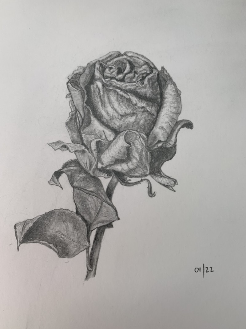
Nice graphite study, Ishbel! II especially like that curling petal out in front. Although you have a lot of variation in tone, I feel like it looks a little flat, but I’m not sure why. I think it may be because all of your highlights are similar in value? Maybe you could try toning down some of your secondary highlights? I’m not sure. I’m anxious to hear what other people think. It’s really love, though. Very nice drawing. You can tell that you really studied this rose, and paid close attention to every shape and fold.
Thanks for your comments Pam. Again I think the exposure is off in this one which does make the highlights very grey. I need to work on that.
I can see what you’re talking about Ishbel, since the paper looks grey due to exposure. I’m thinking of buying a new scanner and getting the settings right.
Beautiful crinkly details, Ishbel!