Wow Ishbel! What a striking image! Gorgeous! I would suggest adding some more darks to some of the leaves – for example the “V” area of the top leaf on the right. It should be in shadow, as you showed on the bud to it’s right. The way it is now, the bud looks like it is in front of the leaf. Another leaf to take a look at is the one near the bottom on the left. I would add some darker tones near it’s base where it meets the flower. I would expect those darker tones to be there and it will also make your focal point pop even more. It was a good choice to make the one leaf at the bottom be lighter and less detailed. I question if you even needed to have included that leaf at all. My last thoughts are about the bud on the upper left. Remember to not have parts line up. The upper edge of the larger bud lines up with the tip of the bud to it’s right. It would look much better if there was a distinct level change. That bud is also reading a little flat due to a lack of tonal range. Look at the great range of tones that are on the bud on the right and how the contrast brings the drama this piece exudes! I know the bud on the right is closer to the light source, but it still needs (and would have) some dark tones!
Thanks for these extensive comments Doug. I’ve tweaked the leaves as suggested and I can see the improvement. Interesting comment about the bottom left leaf. I added that because I thought it improved the composition – I didn’t like the way the stem and three leaves was setting up a cross.
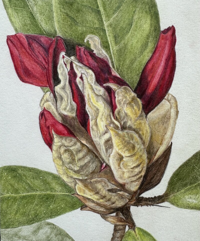
Wow Ishbel! What a striking image! Gorgeous! I would suggest adding some more darks to some of the leaves – for example the “V” area of the top leaf on the right. It should be in shadow, as you showed on the bud to it’s right. The way it is now, the bud looks like it is in front of the leaf. Another leaf to take a look at is the one near the bottom on the left. I would add some darker tones near it’s base where it meets the flower. I would expect those darker tones to be there and it will also make your focal point pop even more. It was a good choice to make the one leaf at the bottom be lighter and less detailed. I question if you even needed to have included that leaf at all. My last thoughts are about the bud on the upper left. Remember to not have parts line up. The upper edge of the larger bud lines up with the tip of the bud to it’s right. It would look much better if there was a distinct level change. That bud is also reading a little flat due to a lack of tonal range. Look at the great range of tones that are on the bud on the right and how the contrast brings the drama this piece exudes! I know the bud on the right is closer to the light source, but it still needs (and would have) some dark tones!
Wow, Ishbel, this is gorgeous. The composition is very intriguing/captivating, too!
The texture and colours are so striking!