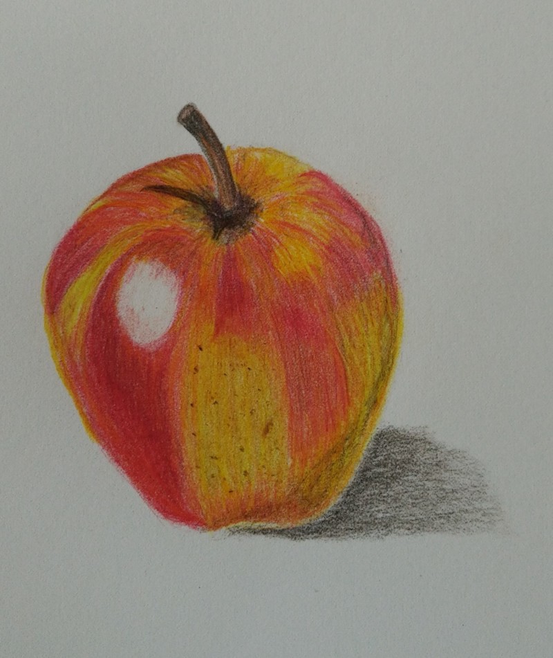
This apple has lovely color, Jette, and you did a nice job applying to pattern, especially on the top right. I think what you could work on overall is gradual transitions between all of your tones. Things seem to jump very quickly from dark to light, without a lot of smooth tones in between. For example, on the shadow side of this apple, I can see sort of a line that shows where the shadow starts… that should blend right into the fruit color, so that it is a smooth transition and feels like part of the whole. Also in the highlight: it jumps very quickly from that nice, saturated red to bright white very fast, almost with a hard edge, making the highlight look like it could be a hole. Try erasing a bit around the highlight to gradually go from that red to a lighter red, to an even lighter red, and then, finally the white of the highlight. I think your cast shadow reads a little strong here, and distracts from the lovely form of the apple. Tone down that shadow so it fades gracefully into the paper (try using gray instead of Sepia for this). That cast shadow should come right up to the edge of the form so that there is not a white space between the form and the shadow. I know that’s a lot, but I think you can work this a little more and see a huge difference. If you work on those transitions and smooth gradients, your apple will pop right off the page! 🙂 Great work. Keep it up.
This apple has lovely color, Jette, and you did a nice job applying to pattern, especially on the top right. I think what you could work on overall is gradual transitions between all of your tones. Things seem to jump very quickly from dark to light, without a lot of smooth tones in between. For example, on the shadow side of this apple, I can see sort of a line that shows where the shadow starts… that should blend right into the fruit color, so that it is a smooth transition and feels like part of the whole. Also in the highlight: it jumps very quickly from that nice, saturated red to bright white very fast, almost with a hard edge, making the highlight look like it could be a hole. Try erasing a bit around the highlight to gradually go from that red to a lighter red, to an even lighter red, and then, finally the white of the highlight. I think your cast shadow reads a little strong here, and distracts from the lovely form of the apple. Tone down that shadow so it fades gracefully into the paper (try using gray instead of Sepia for this). That cast shadow should come right up to the edge of the form so that there is not a white space between the form and the shadow. I know that’s a lot, but I think you can work this a little more and see a huge difference. If you work on those transitions and smooth gradients, your apple will pop right off the page! 🙂 Great work. Keep it up.