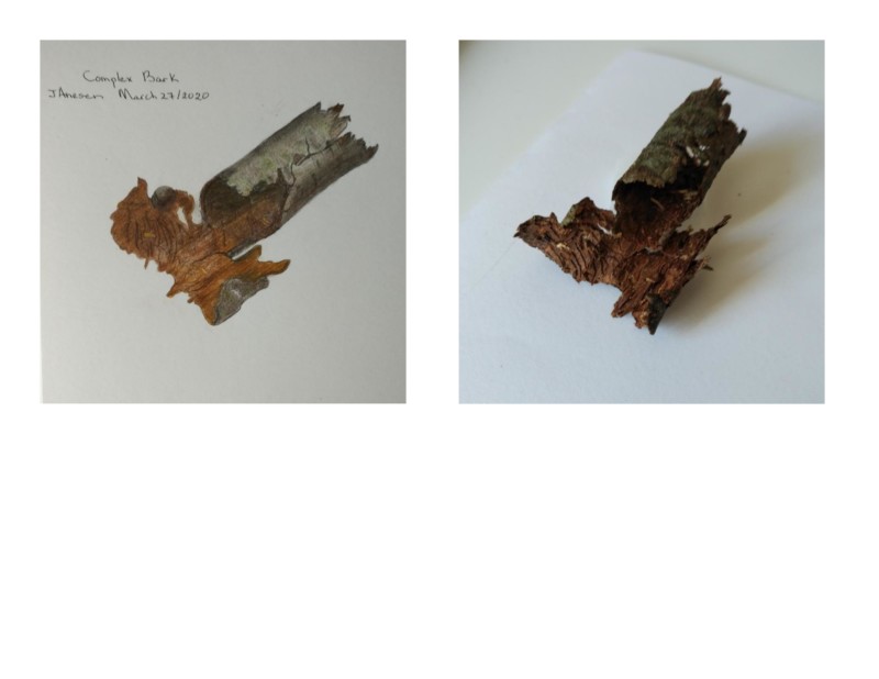
Hello – what a difficult assignment, so challenging, but look to your suggestions. Also I dont seem to get the angles of my photos of the items as they are for drawing. This also is a good challenge. thanks
Hi Jette- this piece of bark is looking really good! It is a great subject and I can see why it would be a good challenge! Your colors and saturation are well done. I like the cylindrical toning on the top section, but it looks like your highlight is right of center and I would expect it to be left of center. The dark toning on the right side of the top section could be darker (you should decide on doing a reflected highlight first). The bark that curls up on the bottom right side should also have some dark and mid-range toning. I think you could go a little darker on the left side and top of the curve of the top section. I would also tone the left side of the bottom section to convey that it curves down to the middle. Start darker at the top and transition lighter as you go down. These are a couple of small changes that would help it read better. Concerning the cast shadow and reflected highlight it is up to you. I think your drawing could benefit from it. When a subject is lying on a surface the cast shadow helps ground the subject in addition to conveying it is lying on the surface. Consequently if your subject is lying on a surface there most likely will be a reflected highlight from light bouncing off the surface. The cast shadow would be even lighter than what shows in the photo and it can just be a suggestion and fade out as it moves back. The angle of the shadow in the photo is what you are shooting for. Grey verithins are good for shadows. Really good job! You got this!
Hello – what a difficult assignment, so challenging, but look to your suggestions. Also I dont seem to get the angles of my photos of the items as they are for drawing. This also is a good challenge. thanks
Also wondering if I should have added a cast / reflective shadow. I am unsure as may drawings do not always include them. thanks
Hi Jette- this piece of bark is looking really good! It is a great subject and I can see why it would be a good challenge! Your colors and saturation are well done. I like the cylindrical toning on the top section, but it looks like your highlight is right of center and I would expect it to be left of center. The dark toning on the right side of the top section could be darker (you should decide on doing a reflected highlight first). The bark that curls up on the bottom right side should also have some dark and mid-range toning. I think you could go a little darker on the left side and top of the curve of the top section. I would also tone the left side of the bottom section to convey that it curves down to the middle. Start darker at the top and transition lighter as you go down. These are a couple of small changes that would help it read better. Concerning the cast shadow and reflected highlight it is up to you. I think your drawing could benefit from it. When a subject is lying on a surface the cast shadow helps ground the subject in addition to conveying it is lying on the surface. Consequently if your subject is lying on a surface there most likely will be a reflected highlight from light bouncing off the surface. The cast shadow would be even lighter than what shows in the photo and it can just be a suggestion and fade out as it moves back. The angle of the shadow in the photo is what you are shooting for. Grey verithins are good for shadows. Really good job! You got this!