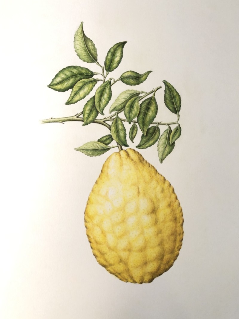
Hi Jill, I love a well drawn yellow colored anything. So I’m lovin this. As usual your toning is exquisite! Flawless! I can almost feel that bumpy surface. The one thing that bothers me about this drawing is that the edges seem a bit “outlined”. I think it would help if you bring some of those darker values into the shadows of the bumps as it curves up toward the highlight. Think of reflective light and core shadow.
Beautiful bumps like on your beautiful sand dollar.
01 September 2021
Jill, as usual, your details are stunning here. One thing that I notice–and this may be related to Doug’s “outline” comment–is that despite the lovely toning, the fruit almost feels flat. And I think it has to do with the edge treatment. Try feathering those darkest tones into the fruit a bit more so they don’t just sit on the edges. I think that will help make the whole form feel more round. Something about those dark shadows along the bumpy edge almost make it seem like this has a flat back and is sitting on a surface… ? Hard to put a finger on. But I think just bringing those dark tones into the form a bit more could do it…. try on tracing paper first? Gorgeous job with the bumpy skin surface! (As usual, I am curious about the inside of this fruit… does it look like a traditional lemon? Or does the bumpy skin somehow affect the pulp inside?)
Hi Jill, I love a well drawn yellow colored anything. So I’m lovin this. As usual your toning is exquisite! Flawless! I can almost feel that bumpy surface. The one thing that bothers me about this drawing is that the edges seem a bit “outlined”. I think it would help if you bring some of those darker values into the shadows of the bumps as it curves up toward the highlight. Think of reflective light and core shadow.
Oh, and I forgot to mention the leaves. I love them! They are so lively. Almost like they are having a conversation with each other.
So lovely! What kind of fruit is this?
Beautiful bumps like on your beautiful sand dollar.
Jill, as usual, your details are stunning here. One thing that I notice–and this may be related to Doug’s “outline” comment–is that despite the lovely toning, the fruit almost feels flat. And I think it has to do with the edge treatment. Try feathering those darkest tones into the fruit a bit more so they don’t just sit on the edges. I think that will help make the whole form feel more round. Something about those dark shadows along the bumpy edge almost make it seem like this has a flat back and is sitting on a surface… ? Hard to put a finger on. But I think just bringing those dark tones into the form a bit more could do it…. try on tracing paper first? Gorgeous job with the bumpy skin surface! (As usual, I am curious about the inside of this fruit… does it look like a traditional lemon? Or does the bumpy skin somehow affect the pulp inside?)
Wow, Jill, this is gorgeous. I like Katy’s suggestion – I think it’ll be unifying.