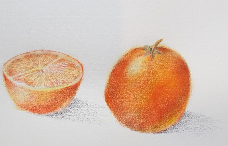
Nice job Catherine! The saturation is much better and you could add even more. Be aware that the darkest tone on the left side edge should be 3-4 on the tonal scale as it is the edge closest to the light source. The right side could use more dark tones to emphasize the oranges form. For an orange subject the red/violet pencil is good for toning. The reflected light looks good! The area of the cast shadow at the base of the orange could be a bit darker and fade out as you have done. Judging from the direction of the cast shadows it looks like your light source is coming the left rather than over your left shoulder at a 45 degree angle. The segments shown in the cut away view look great! You are making good progress!
Nice job Catherine! The saturation is much better and you could add even more. Be aware that the darkest tone on the left side edge should be 3-4 on the tonal scale as it is the edge closest to the light source. The right side could use more dark tones to emphasize the oranges form. For an orange subject the red/violet pencil is good for toning. The reflected light looks good! The area of the cast shadow at the base of the orange could be a bit darker and fade out as you have done. Judging from the direction of the cast shadows it looks like your light source is coming the left rather than over your left shoulder at a 45 degree angle. The segments shown in the cut away view look great! You are making good progress!