You are off to a good start Karen. The colors are great! The berries need more range of tones to establish their form. I would expect to see more highlights and a range of tones into the dark toning on each individual berry. Take a look at your leaves again. At the most basic level, leaves have a light side and dark especially along the primary vein, but there will be variations of toning and color needed to make them look realistic.
Hi Karen- It really helps to put the toning layer on first before you add the color. Also making sure you are leaving the areas where you want the highlights to be. That way you have the form established right from the onset. As you do add color some of the original toning will become obscured, but you adjust the toning as you go. Your original drawing is nicely rendered and the next step would be to add the toning.

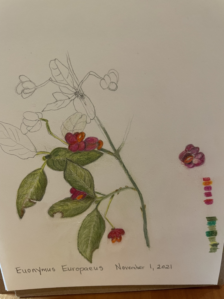
You are off to a good start Karen. The colors are great! The berries need more range of tones to establish their form. I would expect to see more highlights and a range of tones into the dark toning on each individual berry. Take a look at your leaves again. At the most basic level, leaves have a light side and dark especially along the primary vein, but there will be variations of toning and color needed to make them look realistic.
thanks Doug. It’s. challenge for me to balance colour saturation with range of tones. Especially on such a small subject.
Hi Karen- It really helps to put the toning layer on first before you add the color. Also making sure you are leaving the areas where you want the highlights to be. That way you have the form established right from the onset. As you do add color some of the original toning will become obscured, but you adjust the toning as you go. Your original drawing is nicely rendered and the next step would be to add the toning.
Good reminder about the basics. I will try to be more patient!