So much better Karen! Wonderful job!!! This has beautiful form!!! Instead of dark sepia, you can use a very dark green like chrome oxide green, deep cobalt green or even indigo blue. I think maybe the highlight on the side would be a little more elongated. Sorry! I am not understanding your second question.
Thank you Doug! My question is how to make the top of the folded over part of the flower look more natural, and not like a crisp fold. It actually has a soft, gradual curl at the top. Hard to describe in words and in the drawing!
Hi Karen- I see what you mean. I think a couple of things would help. First- where the the left side of the top line meets the curved edge it does not curve up to meet the top of the curve as I would expect it to. It even looks like the top line stops just before the curve. All though subtle, it would help a lot to have the top edge curve up to meet the top of the curved edge. You might even fudge it a little and start to curve the top line a little distance from the curved left edge and that would help soften the top line even more. It doesn’t have to be much. Secondly, your highlight on the top appears mostly as a horizontal bar. I would have the highlight continue up and fold over the top following the curve. Following the curve shape is key! I would expect to see the highlight there and it will help soften the curl and emphasize the form. As I mentioned before, I think elongating and widening the highlight on the side would look more natural. It is exciting to see this drawings progression! Wonderful job Karen!!!
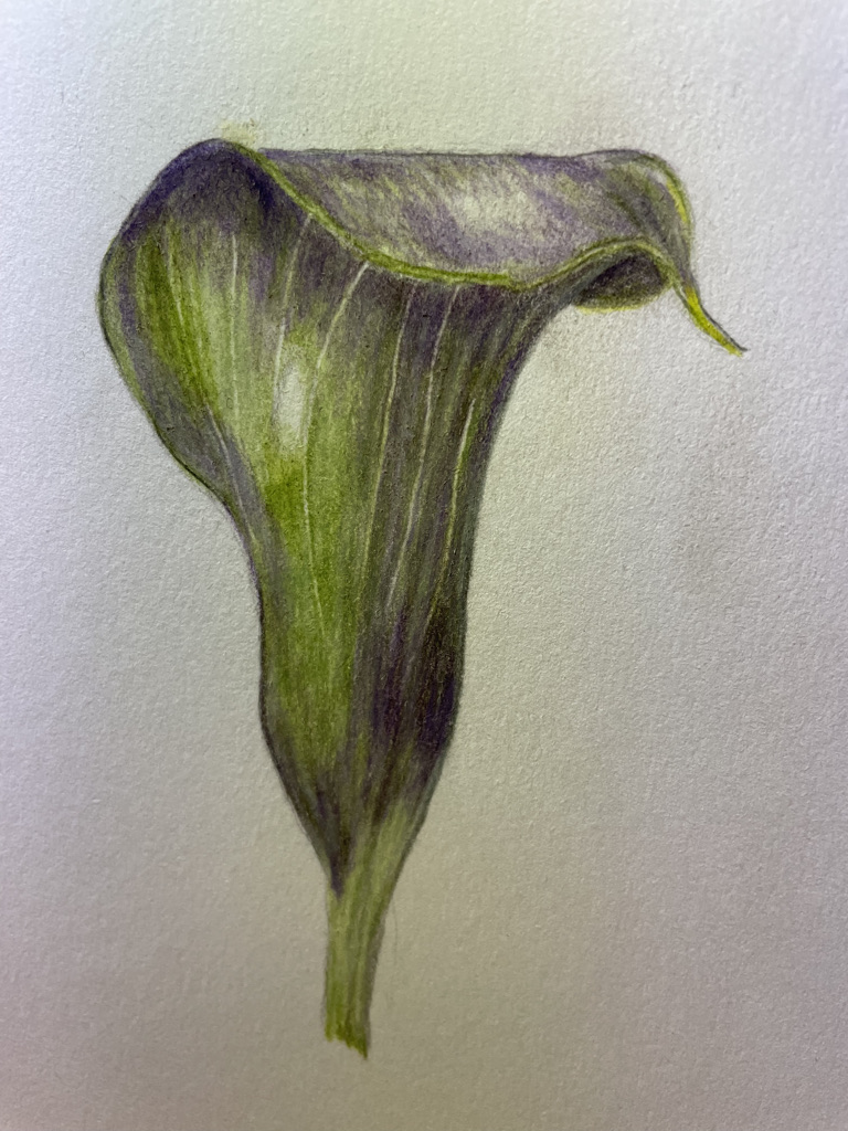
Dark sepia too muddy? And how to get the top line to curl back into the flower?
So much better Karen! Wonderful job!!! This has beautiful form!!! Instead of dark sepia, you can use a very dark green like chrome oxide green, deep cobalt green or even indigo blue. I think maybe the highlight on the side would be a little more elongated. Sorry! I am not understanding your second question.
Thank you Doug! My question is how to make the top of the folded over part of the flower look more natural, and not like a crisp fold. It actually has a soft, gradual curl at the top. Hard to describe in words and in the drawing!
I will try to post a photo of the flower
Hi Karen- I see what you mean. I think a couple of things would help. First- where the the left side of the top line meets the curved edge it does not curve up to meet the top of the curve as I would expect it to. It even looks like the top line stops just before the curve. All though subtle, it would help a lot to have the top edge curve up to meet the top of the curved edge. You might even fudge it a little and start to curve the top line a little distance from the curved left edge and that would help soften the top line even more. It doesn’t have to be much. Secondly, your highlight on the top appears mostly as a horizontal bar. I would have the highlight continue up and fold over the top following the curve. Following the curve shape is key! I would expect to see the highlight there and it will help soften the curl and emphasize the form. As I mentioned before, I think elongating and widening the highlight on the side would look more natural. It is exciting to see this drawings progression! Wonderful job Karen!!!