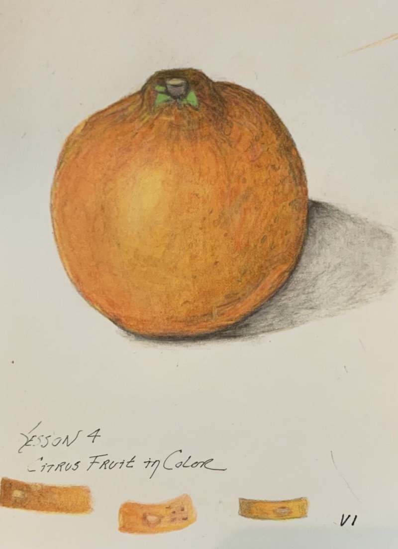
Hi Karen- this is a really nice citrus drawing! Great colors and saturation.! Agreed with Katy on making some changes to the cast shadow on the original version. However, I think this is a little too dark and I would lighten it a little. As you have done you want it to be darkest under the subject and fade lighter as it moves away, but you don’t want it to be too dark so that it competes with the subject, which is your focal point.
Hi Karen- this is a really nice citrus drawing! Great colors and saturation.! Agreed with Katy on making some changes to the cast shadow on the original version. However, I think this is a little too dark and I would lighten it a little. As you have done you want it to be darkest under the subject and fade lighter as it moves away, but you don’t want it to be too dark so that it competes with the subject, which is your focal point.
Thanks…I’ve pulled the eraser out :-).