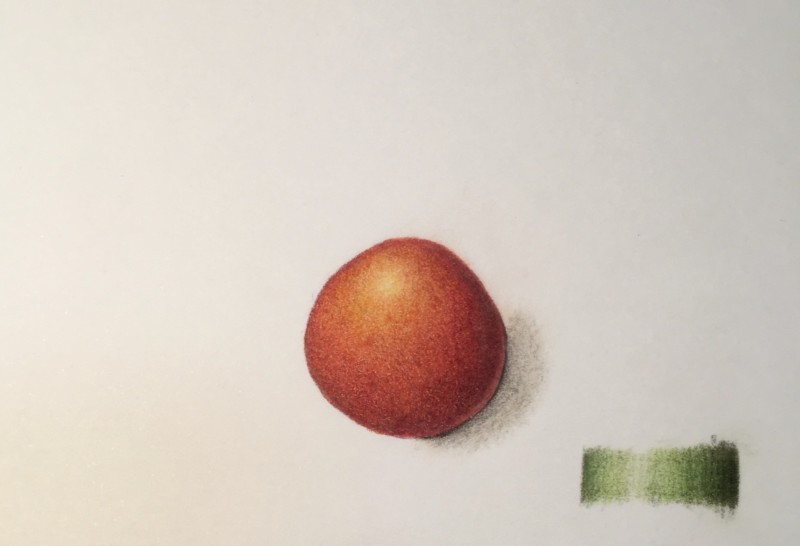
Hi Kayla- you have a great range of tones here! The color selection is good and I think you could add a more saturation. The highlight is a bit high. I would move it down and to the left a little. With your cast shadow, it looks like it is all the same tone. You could start it darker closer to the tomato and have it fade out as it moves away from the subject. It does not have to be wider than you show it. I would continue the curve at the top of the shadow to meet up with the tomato. Your toning is beautiful! Keep up the good work!
Thanks, Doug! I appreciate the helpful feedback, and see what you mean. The cast shadow feels awkward to me, but will hopefully improve and become more natural with practice.