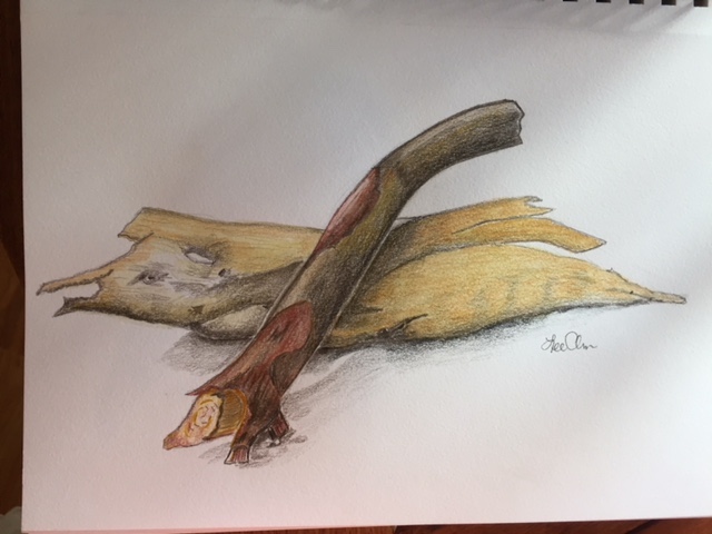
The color is good on your branches. I recommend a couple of things to make the individual branch structures more readable: 1. It is in my opinion a better solution to show overlaps by darkening underneath the form on top and not leaving a blank empty line as you have done. I would lighten the branch on top on the edges to help with contrast. The branch or branches in the back are a bit confusing to me. I am not sure what the structure is. If you have a photo of your branches that would help. Love seeing your series of drawings here! Keep going!
The color is good on your branches. I recommend a couple of things to make the individual branch structures more readable: 1. It is in my opinion a better solution to show overlaps by darkening underneath the form on top and not leaving a blank empty line as you have done. I would lighten the branch on top on the edges to help with contrast. The branch or branches in the back are a bit confusing to me. I am not sure what the structure is. If you have a photo of your branches that would help. Love seeing your series of drawings here! Keep going!
HA! I didnt even see that line…the floating branch. The bottom is a piece of bark. Will correct!