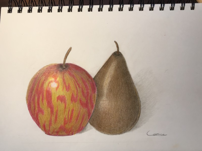
My sweet horse Lark’s favorite treats. Not sure how to do that stem “well” – they don’t look right. Also is my pear highlight too much? Do you tone the highlight on matte colors but keep it light on shiny surfaces?
10 July 2020
Hi Leslie, What a sweet homage to Lark! 🙂 I love the pattern on this apple, and the composition with the 2 of them together. Re: stems, one way to make them look more realistic is to make sure they are not the same width all the way through. Often the stem gets wider where it attaches to the branch; maybe try adjusting the width of these (wider at the top, thinner at the bottom) and see if that helps. The difference between highlights on shiny surfaces and matte surfaces is mostly in how quickly you transition from midtone color to light color to highlight. If that transition happens very quickly, you get a bright, stark highlight that “pops” out of the midtone color and represents a very shiny surface (think wet grapes or apples). If your transition happens more gradually, then the subject will look less “shiny.” It’s still fine to show a bright highlight on a matte pear, but build your tones up to it slowly, so there’s not a jump from midtone to highlight. Does that make sense? In your particular case here, I think you could work on that gradual transition to the highlight, and I also think the highlight could be a different shape… Perhaps in this setup, you’d only see the top part of the highlight and the lower part would be sort of out of view behind the apple? It’s tough when your subjects are arranged so that there’s an overlap happening right in the spot where your highlight might go. Take a photograph with the lighting set up correctly and see what you find.
My sweet horse Lark’s favorite treats. Not sure how to do that stem “well” – they don’t look right. Also is my pear highlight too much? Do you tone the highlight on matte colors but keep it light on shiny surfaces?
Hi Leslie, What a sweet homage to Lark! 🙂 I love the pattern on this apple, and the composition with the 2 of them together. Re: stems, one way to make them look more realistic is to make sure they are not the same width all the way through. Often the stem gets wider where it attaches to the branch; maybe try adjusting the width of these (wider at the top, thinner at the bottom) and see if that helps. The difference between highlights on shiny surfaces and matte surfaces is mostly in how quickly you transition from midtone color to light color to highlight. If that transition happens very quickly, you get a bright, stark highlight that “pops” out of the midtone color and represents a very shiny surface (think wet grapes or apples). If your transition happens more gradually, then the subject will look less “shiny.” It’s still fine to show a bright highlight on a matte pear, but build your tones up to it slowly, so there’s not a jump from midtone to highlight. Does that make sense? In your particular case here, I think you could work on that gradual transition to the highlight, and I also think the highlight could be a different shape… Perhaps in this setup, you’d only see the top part of the highlight and the lower part would be sort of out of view behind the apple? It’s tough when your subjects are arranged so that there’s an overlap happening right in the spot where your highlight might go. Take a photograph with the lighting set up correctly and see what you find.
That apple is super cool. I like how the pear highlight is dull. This skin of bosc pears is like that.
Thank you Vern that makes sense! And thank you Eleanor!