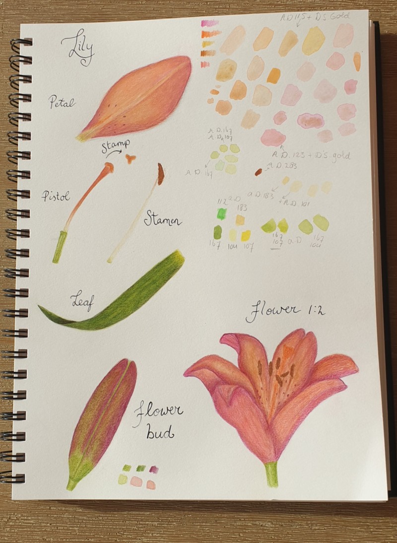
Yay, my first study page. This is what I want to learn to refine. I feel the composition is not superb, I did not plan it in advance which dis not help. to many swqtches above so that will need to be changed in the next one. The lily is not delicate and transluscent enough. Any suggestions are welcome. I did make a kiatake un thw proces painting the flower. Started with a few layers of watercolor, then pencil, then shading with darker pencil which could have been done earlier. I struggle with the color mixing and highlights to. But all in all, happy to have done it. To get to good art you have to make bad art first.
Good first attempt on a study page. You have all the right elements. I would have made the flower a bit more front and center. And have its elements surround it. the leaf is quite nicely drawn! As for the flower, you need some darker and lighter values. it is all sort of mid tones. I’d go in and darken the anthers. Then darken the shadows where they over lap. Try using a dark sepia..
Thank you Katy. I appreciate your help. More dark sepia, can do!
30 October 2020
Yes, the balance between light and dark is what will give your drawings more 3-d quality and lifelike color. Yes, more darks are needed in the flower, but also next time be sure to leave some white of the paper showing through in a few places–the combination of both the very light and the very dark is what will really take your drawing to the next level. Love this study page, and it seems like you are learning a lot! (Haha the “stamp” of the pistil is my favorite part of this–so cute, and informative!).
Aha, it is a pistil, I thought pistol seemed a bit violent! And yes, more white next time for sure, and dark sepia, but that can be layered after luckily.
Yay, my first study page. This is what I want to learn to refine. I feel the composition is not superb, I did not plan it in advance which dis not help. to many swqtches above so that will need to be changed in the next one. The lily is not delicate and transluscent enough. Any suggestions are welcome. I did make a kiatake un thw proces painting the flower. Started with a few layers of watercolor, then pencil, then shading with darker pencil which could have been done earlier. I struggle with the color mixing and highlights to. But all in all, happy to have done it. To get to good art you have to make bad art first.
Sorry for the typos. It is a challenge to post on my phone. Kiatake is mistake. Hope the rest makes sense.
Yeah, I was wondering what a Kiatake was!
Good first attempt on a study page. You have all the right elements. I would have made the flower a bit more front and center. And have its elements surround it. the leaf is quite nicely drawn! As for the flower, you need some darker and lighter values. it is all sort of mid tones. I’d go in and darken the anthers. Then darken the shadows where they over lap. Try using a dark sepia..
Thank you Katy. I appreciate your help. More dark sepia, can do!
Yes, the balance between light and dark is what will give your drawings more 3-d quality and lifelike color. Yes, more darks are needed in the flower, but also next time be sure to leave some white of the paper showing through in a few places–the combination of both the very light and the very dark is what will really take your drawing to the next level. Love this study page, and it seems like you are learning a lot! (Haha the “stamp” of the pistil is my favorite part of this–so cute, and informative!).
Aha, it is a pistil, I thought pistol seemed a bit violent! And yes, more white next time for sure, and dark sepia, but that can be layered after luckily.
Kiatakes are the key to learning. 🙂 May we make many Kiatakes together in our drawing practice.