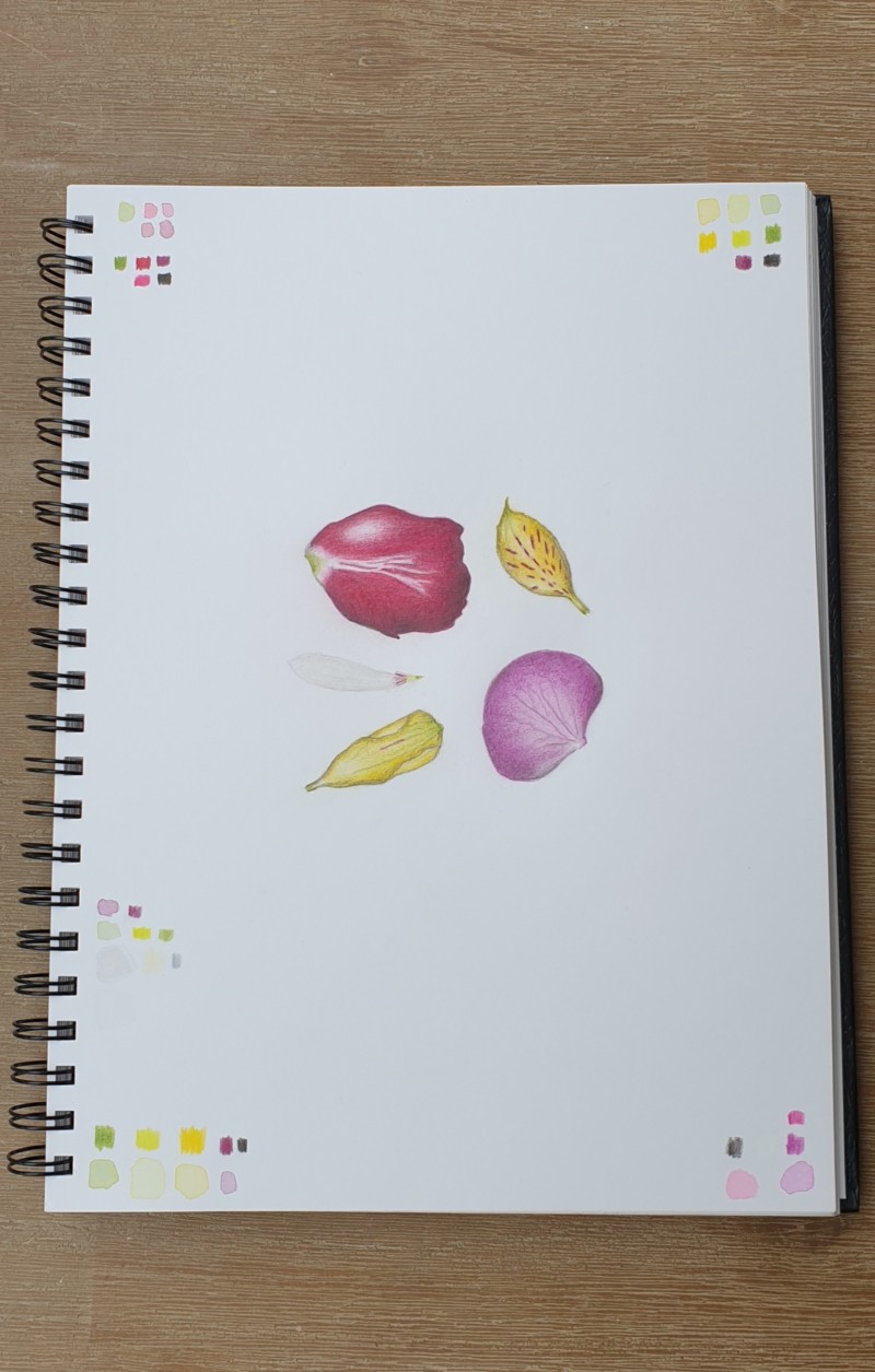
Happy with all petals but the top right. I was struggeling with how to define the edge of the light yellow petals and went with dark sepia. Suggestions on how to do this next time very welcome, as is feedback on improving this work. THANK YOU!!
These are looking great and fun together. I like that white one. Verithin grey can be helpful for outlining yellow petals. So can a sharp earth green. Work on showing me a highlight on each petal. Looks like the white streaks in the red petal could be toned down – observe – are they a light red? The highlight and the shadow on the red are looking good. I bet more red violet can add to the shading on your pink flower – and definitely show me the highlight on that one. Great work!
You could do some thumbnail quick sketches in only dark sepia of where your highlights and shaded sides are, so that you can “see” the forms before you start colouring.
04 November 2020
Great suggestions from Sam. I’d also add that when you are working on petal edges, minimize the amount of “outline” by using “sensitive line;” a line that sort of comes and goes, varies in thickness, and is subtle and graceful. (This takes practice, but it really helps to define petal edges without them feeling too heavy.) You’ll need a VERY SHARP pencil for this! You can use Gray Verithin, Dark Sepia, or even colors like Red Violet or Burnt Ochre, depending on the color of the petal. You want something dark, but that’s still in the color family of the petal. Beautiful study of petals here!!
Happy with all petals but the top right. I was struggeling with how to define the edge of the light yellow petals and went with dark sepia. Suggestions on how to do this next time very welcome, as is feedback on improving this work. THANK YOU!!
These are looking great and fun together. I like that white one. Verithin grey can be helpful for outlining yellow petals. So can a sharp earth green. Work on showing me a highlight on each petal. Looks like the white streaks in the red petal could be toned down – observe – are they a light red? The highlight and the shadow on the red are looking good. I bet more red violet can add to the shading on your pink flower – and definitely show me the highlight on that one. Great work!
You could do some thumbnail quick sketches in only dark sepia of where your highlights and shaded sides are, so that you can “see” the forms before you start colouring.
Great suggestions from Sam. I’d also add that when you are working on petal edges, minimize the amount of “outline” by using “sensitive line;” a line that sort of comes and goes, varies in thickness, and is subtle and graceful. (This takes practice, but it really helps to define petal edges without them feeling too heavy.) You’ll need a VERY SHARP pencil for this! You can use Gray Verithin, Dark Sepia, or even colors like Red Violet or Burnt Ochre, depending on the color of the petal. You want something dark, but that’s still in the color family of the petal. Beautiful study of petals here!!
This is all great advice. Thank you! I will try to improve this and take it for the next drawing, yay, love it 🙂