I am struggling with adding the color red. I took a picture in grayscale as Wendy suggested and I have left the areas white as the photo suggested. But how do you tone to maintain highlights. There is so little color variation in the red of this carnation. It is almost deep black in tiny spots and then bright red.
Hi Mary! Beautiful drawing! You have been making good choices in exploring how to get a range of tones (including highlights) on a dark colored subject. Deep reds, purples, greens, etc. that are a matte finish are all a challenge! I think on the grey scale view you could have added a lot more range of dark and medium tones to emphasize the carnations form. Taking a picture of a properly lit subject in black and white helps you see what tones go where and it also helps you identify what areas are lighter/darker because of color and what is lighter/darker because of shadows. The key words in that sentence is that the subject is properly lit! Based on your grey scale drawing the lighting could be better. Unless the subject has a shiny surface, I would not have a white highlight on a dark colored subject. It creates a strong contrast, which does not look realistic and that is what you are struggling with. Instead of white highlights use lighter tones of the main color of your subject (not the lightest or darkest color). The drawing in the center appears as if the petals have white tips and and toning the brightness down with an appropriate range of colors will help. There are spots I would also lighten on the center view that should, but do not currently show highlights where I would expect them. Personally I would use a simpler flower to practice on. The carnations have so many petals and something like a pansy, which will be available soon, would be a great subject. I hope this helps and let me know if you need further clarification. You are on a good, but I know, frustrating path and it is a good lesson for all of us! Thank you for sharing!
I find red really difficult, and you are doing a great job at figuring out how to handle it. I think that Doug has given you great suggestions, and I also think that you are getting the right idea. You have to push things a bit with reds to give them form (make your lights a little lighter than what you see, and your darks a little darker than what you see, and I see that starting to happen here. Keep practicing. You are doing great.
Thank you for all the feedback. I have put this on the back burner for awhile, but will return to it later maybe with a less complicated flower. But, now I have some pointers on how I would approach the problem. Many Thanks!
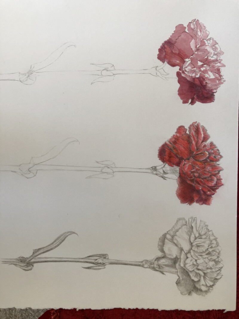