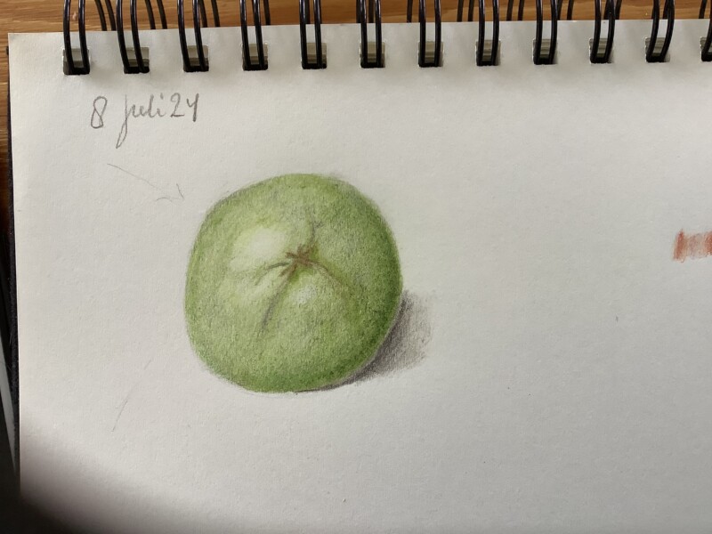
Hi Marijke! You are off to a good start! Beautiful color and really nice tonal quality! You have a great dark tone on the right side, but it needs to transition seamlessly thru the mid-range tones as it moves toward the main highlight. There should not be a strong crescent shape of dark tone. Remember that the left edge will be a 3-4 on the tone scale since it is close to the main highlight. You also need more variation of tones on that side once you establish the tone on the left edge. The tones on the left side are currently too similar. Finally, the cast shadow is a little too dark. It will be darkest at the edge of the subject as you have shown, but then it fades lighter as it moves away. If it is too dark it creates contrast and then draws too much attention. You want a suggestion of the shadow so it grounds the subject to the page. These are a couple of minor things to change that will make a big difference. Nice job!
Hi Marijke! You are off to a good start! Beautiful color and really nice tonal quality! You have a great dark tone on the right side, but it needs to transition seamlessly thru the mid-range tones as it moves toward the main highlight. There should not be a strong crescent shape of dark tone. Remember that the left edge will be a 3-4 on the tone scale since it is close to the main highlight. You also need more variation of tones on that side once you establish the tone on the left edge. The tones on the left side are currently too similar. Finally, the cast shadow is a little too dark. It will be darkest at the edge of the subject as you have shown, but then it fades lighter as it moves away. If it is too dark it creates contrast and then draws too much attention. You want a suggestion of the shadow so it grounds the subject to the page. These are a couple of minor things to change that will make a big difference. Nice job!
Thanks, Doug, I made the little red tomato, to try again.