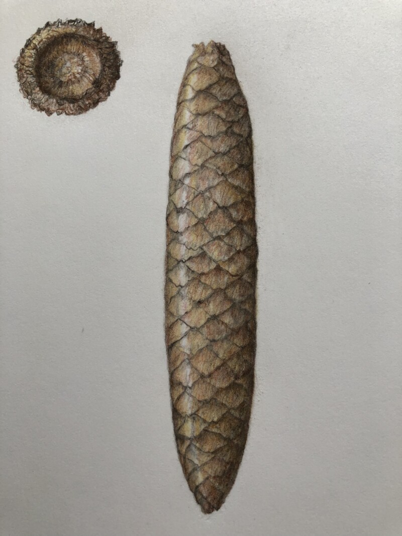
Hi Mary- it is nice seeing your cone in color! Maybe it is the post, but the top and bottom have better saturation than the middle section, which looks a little faded. Those two areas have nice toning in the upside down “v’s” (where the scales meet at their tops) and I would go in and add more toning to punch them up in other areas too! Maybe some of the bottom tips of the scales would catch some highlight too? Really nice job!!!
Hi Mary- it is nice seeing your cone in color! Maybe it is the post, but the top and bottom have better saturation than the middle section, which looks a little faded. Those two areas have nice toning in the upside down “v’s” (where the scales meet at their tops) and I would go in and add more toning to punch them up in other areas too! Maybe some of the bottom tips of the scales would catch some highlight too? Really nice job!!!