Wow!!! Maureen! Love the peel and segments!!! A couple of little things to consider. The cast shadows are a little dark. Also on the right side of the peel, where you see the inside of the peel come down and meet the outside view of the peel at the bottom – I feel like that area of the inside should be toned a little darker. Currently that area looks even a little lighter than the rest of the inside view of the peel and I would expect it to be a little darker. Did you see Katy’s drawings of citrus peels? Also gorgeous! She posted them on the ArtFeed some time ago and hopefully you can still access them! One is currently in the ASBA show at Wave Hill and it won an award.
Thank you, @doug-milne— I’ll revisit the cast shadows and the part of the peel where the light is passing through. I love Katy’s citruses on toned paper. So elegant and beautifully executed! Her ASBA award is well-earned.
Maureen, This is such a lovely composition. I especially love those sections. They are wonderful. And that curling leaf! – wonderful!. Orange is a tough color. If you don’t get dark enough, it can look flat, but if you go to gray or too blue, it can start to look dirty. I’m feeling just a bit of this in the shadows. They look a little dirty to me. I wouldn’t change what you did here, what I’m talking about it nit-picky, but just want to mention it for future drawings. When working with tricky colors like orange, I like to add in my shadows very slowly. And, it can help to play with tone-bars to figure out the shadow colors before getting started. Some shadow colors that I sometimes like to start with for orange subjects are Burnt Ochre (for deep oranges) and/or Earth Green (for more yellowy oranges). And then I’ll maybe add in a little red-violet and/or purple-violet in the core shadow area. And I wait until the very end to put those dark sepia shadows in. Again, this is just nit-picky advice for the future, this drawing is great!
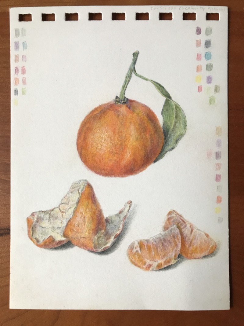
@doug-milne I addressed the issue with the highlight — I agree that it looked odd, thanks for that feedback. And now with peel and segments.
Wow!!! Maureen! Love the peel and segments!!! A couple of little things to consider. The cast shadows are a little dark. Also on the right side of the peel, where you see the inside of the peel come down and meet the outside view of the peel at the bottom – I feel like that area of the inside should be toned a little darker. Currently that area looks even a little lighter than the rest of the inside view of the peel and I would expect it to be a little darker. Did you see Katy’s drawings of citrus peels? Also gorgeous! She posted them on the ArtFeed some time ago and hopefully you can still access them! One is currently in the ASBA show at Wave Hill and it won an award.
Thank you, @doug-milne— I’ll revisit the cast shadows and the part of the peel where the light is passing through. I love Katy’s citruses on toned paper. So elegant and beautifully executed! Her ASBA award is well-earned.
Maureen, This is such a lovely composition. I especially love those sections. They are wonderful. And that curling leaf! – wonderful!. Orange is a tough color. If you don’t get dark enough, it can look flat, but if you go to gray or too blue, it can start to look dirty. I’m feeling just a bit of this in the shadows. They look a little dirty to me. I wouldn’t change what you did here, what I’m talking about it nit-picky, but just want to mention it for future drawings. When working with tricky colors like orange, I like to add in my shadows very slowly. And, it can help to play with tone-bars to figure out the shadow colors before getting started. Some shadow colors that I sometimes like to start with for orange subjects are Burnt Ochre (for deep oranges) and/or Earth Green (for more yellowy oranges). And then I’ll maybe add in a little red-violet and/or purple-violet in the core shadow area. And I wait until the very end to put those dark sepia shadows in. Again, this is just nit-picky advice for the future, this drawing is great!