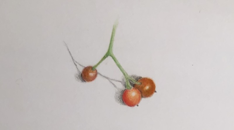
I tried using some Prismacolor pencils and Mixed Media Zeta Series paper that my friend had. I think I prefer the Polychromos and the Legion Stonehenge Aqua.
Beautiful berry study! The berries look translucent! I get a little lost in the area behind the two berries. I would lighten the shadows and also have more range on the shading of the green stems to delineate them more.
05 December 2019
Sherry, I like the texture of polychromos on stonehenge, too. There’s something more…painterly (?) about the way those materials interact, compared to the prismas. I agree with Doug here: work a bit more on clarifying the details where the berry meets the stem. Lovely work!
I tried using some Prismacolor pencils and Mixed Media Zeta Series paper that my friend had. I think I prefer the Polychromos and the Legion Stonehenge Aqua.
Beautiful berry study! The berries look translucent! I get a little lost in the area behind the two berries. I would lighten the shadows and also have more range on the shading of the green stems to delineate them more.
Sherry, I like the texture of polychromos on stonehenge, too. There’s something more…painterly (?) about the way those materials interact, compared to the prismas. I agree with Doug here: work a bit more on clarifying the details where the berry meets the stem. Lovely work!