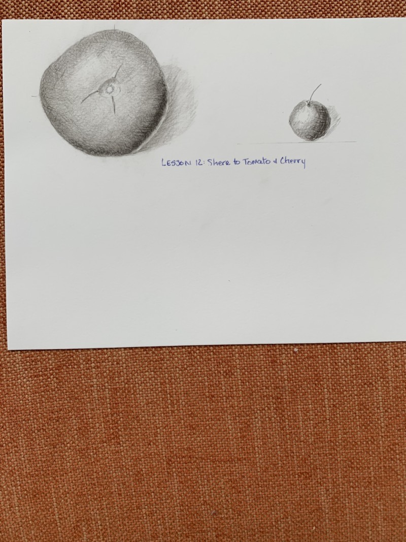
Hi Pamela- the reflective highlight should have some tone to it and blend into the adjoining dark toning. It should not be as white as the main highlight. You can see here where the reflective highlight looks like it is on the table surface rather than the tomato. The cast shadow’s angle is good. I would be slightly darker closest to the subject and fade out more as it moves away from the subject. Try working on that smooth toning so you don’t see the pencil marks.
Hi Pamela- the reflective highlight should have some tone to it and blend into the adjoining dark toning. It should not be as white as the main highlight. You can see here where the reflective highlight looks like it is on the table surface rather than the tomato. The cast shadow’s angle is good. I would be slightly darker closest to the subject and fade out more as it moves away from the subject. Try working on that smooth toning so you don’t see the pencil marks.
Thank you for your specific suggestions-very helpful!