Hi Patricia- the dark toning reads better on this color version and the sprouts have nice form. This is a beautiful drawing! Bravo! There are a couple of things you might consider to making it even better. I would revisit the highlights. I would expect (and see in the photo) that as the sprouts are laying down, the highlight would be lower on the sprout instead of up near the top. As I mentioned on the post of the graphite version of the sprouts, the concave leaf is reading as convex because of the toning. I would lighten the dark toning on the upper right and erase the dark toning on the right side. You can definitely use a medium or dark green for the grisailles layer when the subject is a light green rather than the dark sepia, which can muddy the top coats of color. Light to medium greens are good for yellow and gold subjects and red/violet is a good grisailles choice for red, orange and purple subjects. You could lighten the cast shadow a bit and I would add more dark tone in the triangular area in the center of the three subjects on the left.
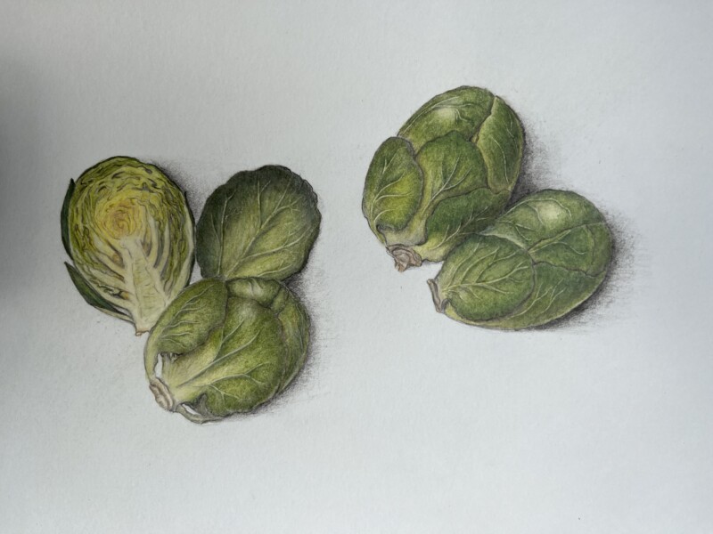
Final rendering of sprouts. I feel like they look dirty. I’m wondering if I should tone with a pencil other than dark sepia.
Love those veins and the longitudinal section! The sprouts look like they will jump out of the paper.
Hi Patricia- the dark toning reads better on this color version and the sprouts have nice form. This is a beautiful drawing! Bravo! There are a couple of things you might consider to making it even better. I would revisit the highlights. I would expect (and see in the photo) that as the sprouts are laying down, the highlight would be lower on the sprout instead of up near the top. As I mentioned on the post of the graphite version of the sprouts, the concave leaf is reading as convex because of the toning. I would lighten the dark toning on the upper right and erase the dark toning on the right side. You can definitely use a medium or dark green for the grisailles layer when the subject is a light green rather than the dark sepia, which can muddy the top coats of color. Light to medium greens are good for yellow and gold subjects and red/violet is a good grisailles choice for red, orange and purple subjects. You could lighten the cast shadow a bit and I would add more dark tone in the triangular area in the center of the three subjects on the left.