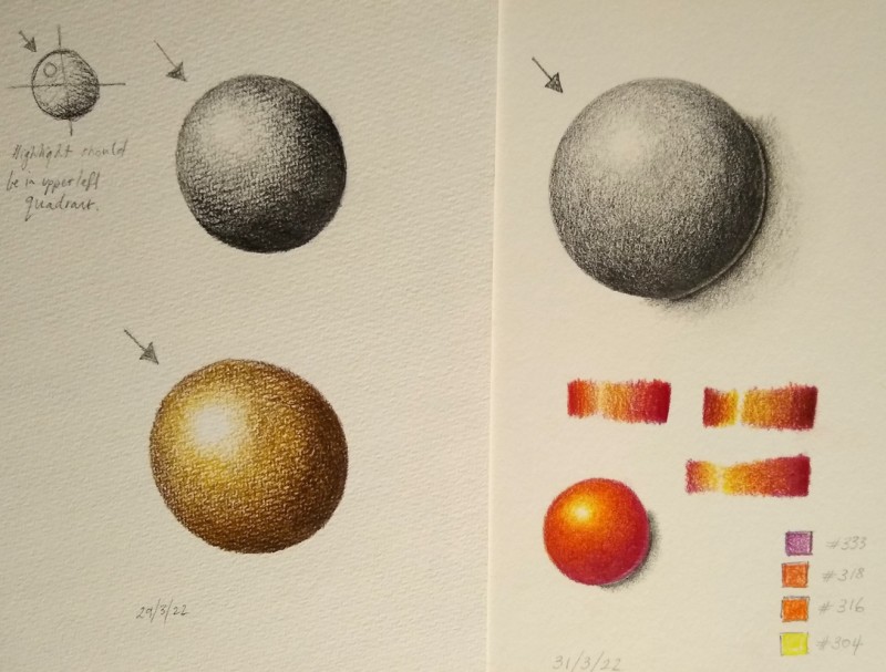
Peta, wow. These are great. Your toning is really wonderful, and you have nailed getting 3D form on these spheres. Your handling of that highlight is just gorgeous. I really love how you are keeping those cast shadows quiet, and the way you are getting really dark where the sphere meets the paper, and then fading out to nothing. I might consider adjusting the shape of that cast shadow just a bit. If you observe a cast shadow of a sphere when lit from the upper left, you will notice that it gets a little wider/longer as travels from the bottom toward the upper right (kind of an egg shape tilted clockwise, if that makes any sense). So, on these, I would just add a little bit of very light toning to the upper right side of these cast shadows. This is pretty advanced, and something that I still struggle with getting right, but the reflected highlight should transition into that core shadow a little more smoothly, could be a little bit larger, and darker. You want it to be around midtone-ish in value. But again, it’s tricky and just something to think about at you progress. You are doing great.
Aha… that’s really helpful about both the cast shadow (which I wasn’t completely happy with) and the transition between the reflected highlight and core shadow. I’ll practice that on the next one because I’m too scared to touch these again. 🙂 Thanks so much for your help.
Yes. Peta. yes. 🙂