Nice leaf Peta- it looks like this is a light colored leaf and the amount of dark toning on the left side is throwing me. I would tone down the dark toning especially on the areas above the secondary veins. It is a very contemporary image because of the strong contrast of dark and light, but it does not look realistic to me for the same reason.
@doug-milne thank you for your feedback. The leaf was actually a dark spinach leaf and I think I was actually afraid of going darker! Wendy kept laying in the green for hers and so I’m wondering if I should put in more too?
You are doing a beautiful job with this. I would just add some more layers, and narrow up some of those secondary veins. Don’t be afraid to go darker. You have a wonderful foundation, just keep saturating that color.
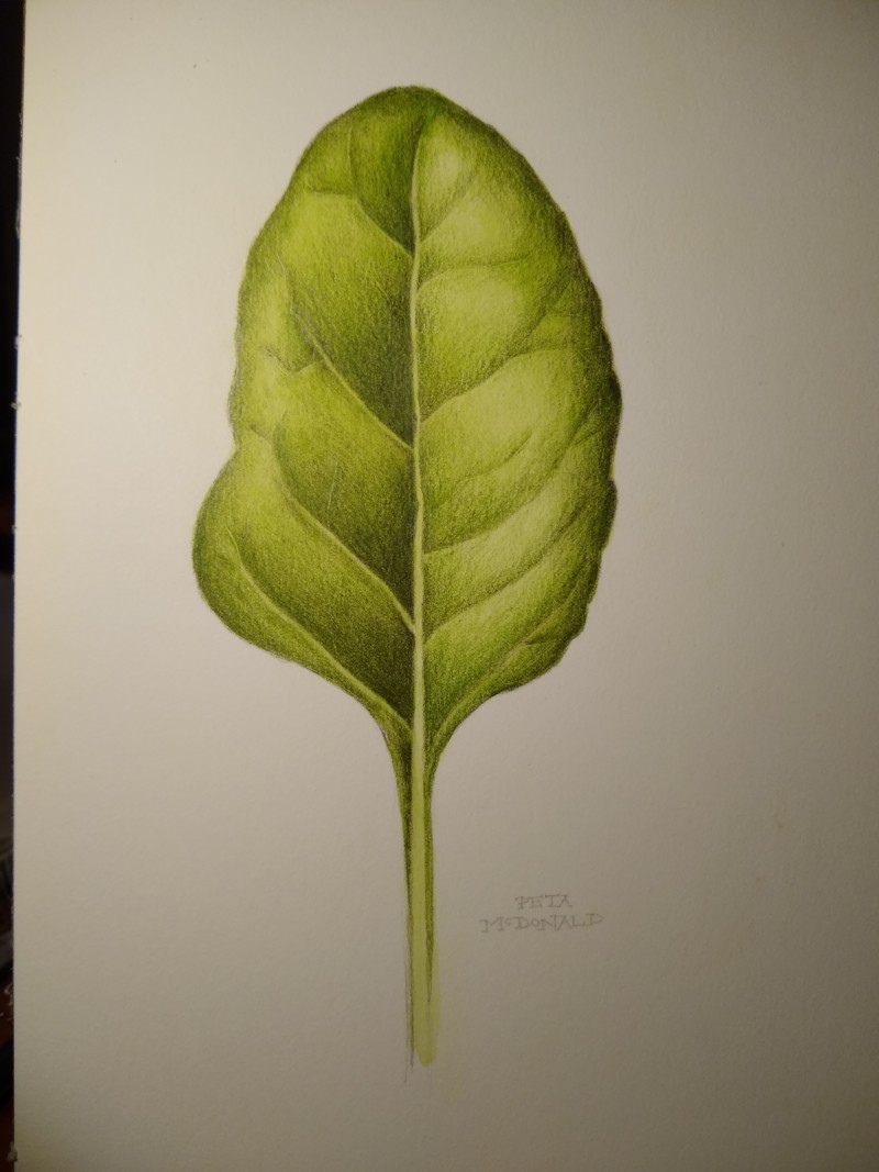
I am enjoying the leaf lesson so much! Thank you Wendy. 🙂 Improvement feedback welcome.
Nice leaf Peta- it looks like this is a light colored leaf and the amount of dark toning on the left side is throwing me. I would tone down the dark toning especially on the areas above the secondary veins. It is a very contemporary image because of the strong contrast of dark and light, but it does not look realistic to me for the same reason.
@doug-milne thank you for your feedback. The leaf was actually a dark spinach leaf and I think I was actually afraid of going darker! Wendy kept laying in the green for hers and so I’m wondering if I should put in more too?
Hi Peta- I would keep working on the leaf so there is more balance and not as much contrast. You are doing a great job!!!!
You are doing a beautiful job with this. I would just add some more layers, and narrow up some of those secondary veins. Don’t be afraid to go darker. You have a wonderful foundation, just keep saturating that color.
Thank you @doug-milne and @pgthompson… I’ll give it a go!