Great job Susan! You really captured the colors and textures of these red grapes. There are a couple of areas I would revisit. The grape on the bottom right (that is hiding behind the other grape) looks like it is part of the grape in the foreground. I would darken it a little to emphasize that it is a separate grape behind the other one. I would also fudge the shape and round it off more to make it a more pleasing shape in addition to differentiating it from the grape in front. On the grape above those two grapes I would darken the left side as it would be shaded by the center grape and there is currently a white line separating those grapes, which shouldn’t be there. One last thing is a highlight on the middle grape on the left. It seems like it should have a stronger highlight. All the other highlights are great and really illustrate how shiny the grapes are! They look delicious!
This really is lovely, congratulations!
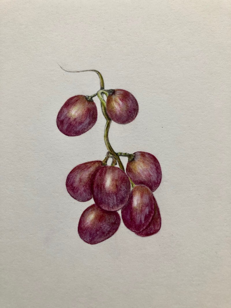
Great job Susan! You really captured the colors and textures of these red grapes. There are a couple of areas I would revisit. The grape on the bottom right (that is hiding behind the other grape) looks like it is part of the grape in the foreground. I would darken it a little to emphasize that it is a separate grape behind the other one. I would also fudge the shape and round it off more to make it a more pleasing shape in addition to differentiating it from the grape in front. On the grape above those two grapes I would darken the left side as it would be shaded by the center grape and there is currently a white line separating those grapes, which shouldn’t be there. One last thing is a highlight on the middle grape on the left. It seems like it should have a stronger highlight. All the other highlights are great and really illustrate how shiny the grapes are! They look delicious!
Thank you Doug – this is a great help to me. I will work on your recommendations and much appreciate the time you took to offer this feedback!
I feel like I could pluck these right off the paper 🙂