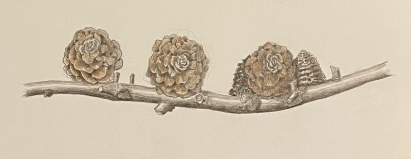
You are really making progress Patricia! It is so good to see you challenging yourself! There are a couple of things to consider here to improve this image. The branch is very good and I would add dark tones under the cones where they sit on the branch. I would do this because I expect the cones to cast shadows on the branch and it visually separates the cone and the branch. There are spots where it is hard to tell where the cone ends and the branch starts. Overall, my biggest concern is that I can not tell where the light source is coming from. If you are right handed, the light is coming over your left shoulder at a 45degree angle. If you are left handed, then the light is coming over your right shoulder. Once you have the light source established you know where to put your highlights and shadows. The cone on the left is the most successful, but still needs more highlights and a range of toning to determine where your light is coming from. The middle cone lacks those nice darks you have in the overlaps as you did so well on the left cone. In addition to missing the form toning (highlights and a range of darks). The cone on the right does not have much definition because there are no highlights or shadows. The toning is all too uniform. The toning on the two cones behind the right cone will change once you establish your light source. On one of your previous posts, I suggested some of Wendy’s lessons that would be good references.
Thanks, Doug. I appreciate your thorough comments and it is especially helpful to “see” what you see. I’m learning to be more patient; to walk away and come back as a way of having a more critical eye on my work. It’s hard to see it sometimes after spending time drawing it. One question about shading. I added color to these pinecones trying to capture the pattern on the scales. Then I wasn’t sure if I should use a dark sepia to add shading to each scale or use a range of color values to show darker and lighter areas. I had a light shining from the left, but did some of the drawing without the spotlight to see the details. Theoretically, I think I understand where the light would create shadows, but I’m not always sure I actually see them. I am motivated to keep tackling these pinecones! They are all so beautiful.
Hi Patricia- now knowing that your light source was coming from the left, I would advise you to have more highlights on the left sides of the cones and a range of dark tones on their bottom and right sides to emphasize the cones form. In regards to the cone at the very right (side view) I would not expect it to have a strong highlight as shown. It seems like the cone to it’s left would be casting a shadow on at least part of it. Dark sepia is a good choice for the base toning of most cones. You can use a variety of colors as needed to put in top of the dark sepia. When you put down the base toning, you are leaving the paper color for the highlight and then a range of tones to represent both the shadows and the in between tones. Remember that when you add one color (let’s say brown) on top of the dark sepia, the brown will look different in areas that don’t have any dark sepia as opposed to the areas that do have a range of dark sepia. So you don’t necessarily need a variety of colors to illustrate lighter and darker areas. You will probably want to use a variety of colors to achieve the colors you want, but that first base layer of dark sepia will do a lot of the work for you establishing the lighter and darker areas.
Thanks, Doug. i’ll keep working on this collection of pine cones. The branch has many. I am posting an update on the single pine cone. I hope it’s an improvement. Interesting how as soon as I darken the tone, I can see more easily how much room there is for the full range of tones.