Hi Rita- it is good to see the progress on your lily! This is coming to life. I can see that you are really working on the highlights and commend you for it!!!! The placement of them is good, but at this point the recent petal’s highlights are too white. A very white highlight implies that the surface of your subject is shiny so the highlights on the newly drawn petals could be toned down some. You would achieve this by adding a small amount of color and still maintain your highlight. Comparing your original petals and the new ones I think the highlights on the original petals are the most successful. Don’t forget to put some dark toning in the well area where the petals meet the stamens. I am confused by the green areas near the center. They look like leaves, but they must be part of the petal design? I don’t see the same detail on the individual petal study. If they are part of the petal design see what you could do to incorporate them into the petal surface a little more. I think it is their sharp lines that conflict with the curvy aspect of the petals shape. Keep up the good work!
Thank you!- I will work on it some more- I have been a little afraid to tone down the highlights because of my history of going overboard with the color, but I am going to continue as you suggest
07 March 2020
Rita, I agree with Doug here, and I think the thing that will really make this drawing feel finished is some carefully placed Dark Sepia in the center where the stamens go inside, and even some super thin dark lines in between some of the stamens, just to clarify that area a bit more. Great job. This is a beautiful drawing!
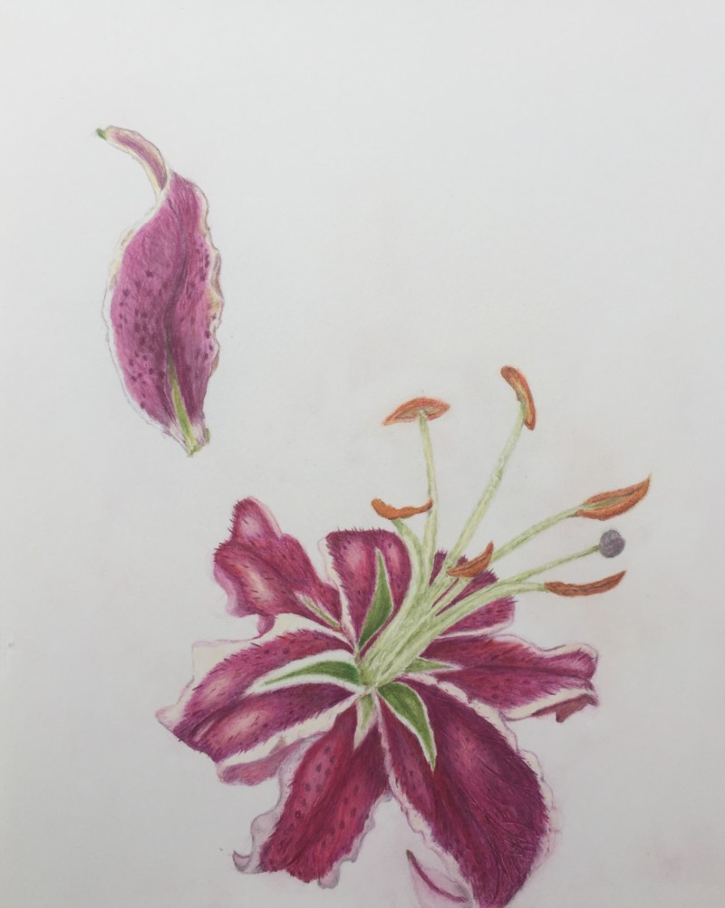
Hi Rita- it is good to see the progress on your lily! This is coming to life. I can see that you are really working on the highlights and commend you for it!!!! The placement of them is good, but at this point the recent petal’s highlights are too white. A very white highlight implies that the surface of your subject is shiny so the highlights on the newly drawn petals could be toned down some. You would achieve this by adding a small amount of color and still maintain your highlight. Comparing your original petals and the new ones I think the highlights on the original petals are the most successful. Don’t forget to put some dark toning in the well area where the petals meet the stamens. I am confused by the green areas near the center. They look like leaves, but they must be part of the petal design? I don’t see the same detail on the individual petal study. If they are part of the petal design see what you could do to incorporate them into the petal surface a little more. I think it is their sharp lines that conflict with the curvy aspect of the petals shape. Keep up the good work!
Thank you!- I will work on it some more- I have been a little afraid to tone down the highlights because of my history of going overboard with the color, but I am going to continue as you suggest
Rita, I agree with Doug here, and I think the thing that will really make this drawing feel finished is some carefully placed Dark Sepia in the center where the stamens go inside, and even some super thin dark lines in between some of the stamens, just to clarify that area a bit more. Great job. This is a beautiful drawing!