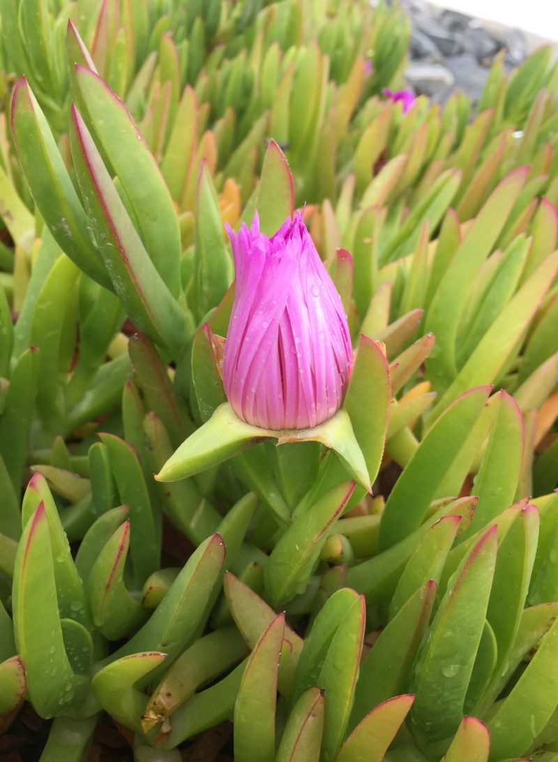
This is not the exact flower I used, but hopefully gives the idea- I actually wanted to do a water drop but I don’t really know how yet- I am noticing in posting this that there is a nice reflective highlight along the base and I made mine uniformly dark- although this is outside and I had done mine inside so there was less overhead light
Hi Rita- thanks for sending the photo! Examining the photo you can get a lot of ideas on how to make your ice plant look more realistic. The first thing I noticed was that the leaves are darker at the base and get lighter as you look up to the top of the leaves. This condition exists and is very noticeable because the photo was taken outside. Does it pertain to your drawing? Maybe yes, maybe no, but it is worth noting. Then I start seeing a lot of details that all definitely pertain! Every single leaf has a range of different greens. Some leaves or portions of them have a lot of yellow, some areas have obvious blue casts. Some leaves have areas with a light coating of red that is transitioning out from the red tips and spines. Love those red tips and spines!!!!! You still want to tone your drawing based on the standard lighting criteria we use for botanical drawing, which is the light is coming over your left shoulder at a 45 degree angle and I mentioned some areas on the previous post. This photo is a great reference tool and it gives you a wealth of information to incorporate into your drawing to bring it to the next level. I can’t go back to your drawing post without losing this note so if I have any comments about the flower I will post it there. I would say however, that I would also use the photo for guidance in capturing the various qualities of the flower.
Thank you!!!