Very nice, Ruthie! I’m wondering what kind of paper you are using. It looks a little “fuzzy”. Do you like working with it?
09 February 2017
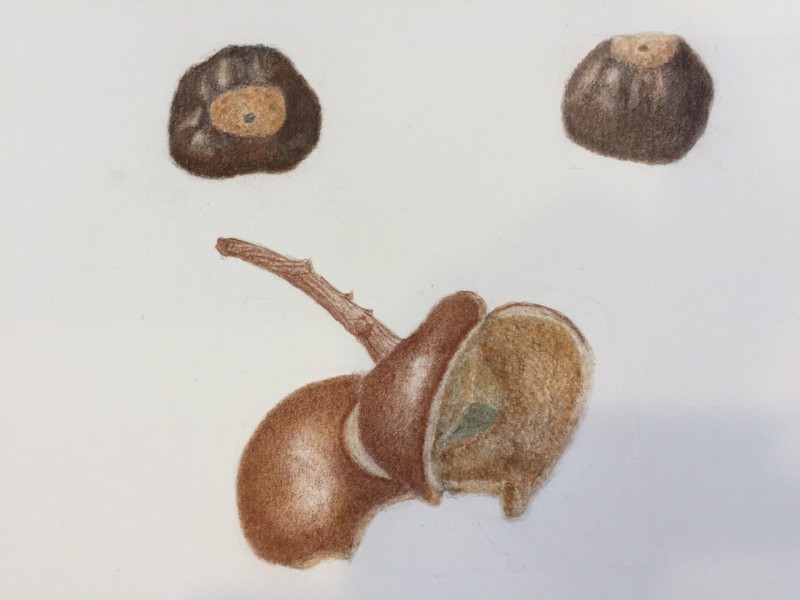
@ruthwilnai What an interesting specimen! Great start here. I think your nut on the top right could use a little more dark saturation on the shadow side to give it a bit more three-dimensionality. That Cap is wild looking! You did a great job with the structure and texture of it; I think it maybe could benefit from some more toning with dark sepia to show us more of the depth in the cup part and where the two caps overlap? Great work.
Hi Ruthie, good choice for a drawing here. YOu are brave. I would recommend thinking about the overlaps first rather than color variation in the bottom drawing of the outer husks. Sometimes a light color could still be darker to create the overlaps. You have emphasized the half moon white color between the two husks. That confuses the main structure which is so much more important to show. Remember what is in front and what is behind!
Thanks Wendy
I see what you mean.
In the drawing there are three husks two on the left that are showing the out side of the cap, the third husk, the brighter one on the left shows the inside of the husk.
The half moon in the drawing is the end of the middle husk. It is high above the third husk. It suppose to show the width of the husk and I really didn’t know how to do it.
Do you think that if I make it darker it will become part of the second husk?
thanks for your help.
I enjoyed doing it.
Very nice, Ruthie! I’m wondering what kind of paper you are using. It looks a little “fuzzy”. Do you like working with it?
@ruthwilnai What an interesting specimen! Great start here. I think your nut on the top right could use a little more dark saturation on the shadow side to give it a bit more three-dimensionality. That Cap is wild looking! You did a great job with the structure and texture of it; I think it maybe could benefit from some more toning with dark sepia to show us more of the depth in the cup part and where the two caps overlap? Great work.
Thanks Andrea
I am using Acquarello, water color, Fabiano, 300g/m2 140lb extra white, 100%cotton
Do you have another paper?
Thanks for the advice I will try them both
Hi Ruthie, good choice for a drawing here. YOu are brave. I would recommend thinking about the overlaps first rather than color variation in the bottom drawing of the outer husks. Sometimes a light color could still be darker to create the overlaps. You have emphasized the half moon white color between the two husks. That confuses the main structure which is so much more important to show. Remember what is in front and what is behind!
Thanks Wendy
I see what you mean.
In the drawing there are three husks two on the left that are showing the out side of the cap, the third husk, the brighter one on the left shows the inside of the husk.
The half moon in the drawing is the end of the middle husk. It is high above the third husk. It suppose to show the width of the husk and I really didn’t know how to do it.
Do you think that if I make it darker it will become part of the second husk?
thanks for your help.
I enjoyed doing it.
Ruthie