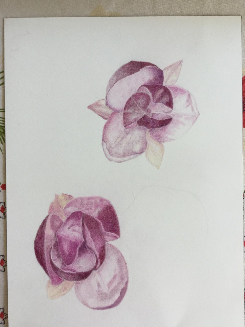
Ruthie, I love your investigation of this flower. I know what you mean about trying to capture it before it wilts and changes! This drawing is well done; you are showing us the way the petals are arranged around the center. I have a few suggestions for improvement: 1. Concentrate on tone before color. Show us clearly what is in front and what is behind; a petal may get darker in tone as it approaches the center of the flower, especially if it is underneath another petal. 2. Try to avoid leaving white space or lines between elements. Bring your tones right up to each other so that structure is clear. Use contrast to create edges of forms. 3. Try this flower from another angle, and/or with a branch and leaves attached! This will give us a better idea of how the plant grows. You’ve done lovely work here. Nice texture on the petals and good color mixing. Keep going! 🙂
Ruthie, I love your investigation of this flower. I know what you mean about trying to capture it before it wilts and changes! This drawing is well done; you are showing us the way the petals are arranged around the center. I have a few suggestions for improvement: 1. Concentrate on tone before color. Show us clearly what is in front and what is behind; a petal may get darker in tone as it approaches the center of the flower, especially if it is underneath another petal. 2. Try to avoid leaving white space or lines between elements. Bring your tones right up to each other so that structure is clear. Use contrast to create edges of forms. 3. Try this flower from another angle, and/or with a branch and leaves attached! This will give us a better idea of how the plant grows. You’ve done lovely work here. Nice texture on the petals and good color mixing. Keep going! 🙂
I really like the look and feel of your drawing. It’s beautiful . The colors are so soft and subtle.
Thanks
It will take me several days to load a new version with correction and branches
Thanks Nancy for your kind words