Hi Maureen- this is looking really good! There are a couple of areas that could use more toning such as where petals fold over and you also see the undersides. The undersides need some more toning and also the “V” areas where some petals meet could use more toning. One more comment is I would make the stem a little greener. It looks very yellow in the picture. Nice job!
27 April 2020
Maureen, this center looks pretty good to me! I know what you mean about sometimes things seem more balanced in the preliminary drawings… Here, it may just be a matter of getting those petals to the left of center to feel more connected to the center. That one beautiful rolling petal on the left almost feels like it’s not connected to the rest of the flower… But overall, I think this is an excellent drawing. Those few more touches that Doug suggested will really finish it off nicely.
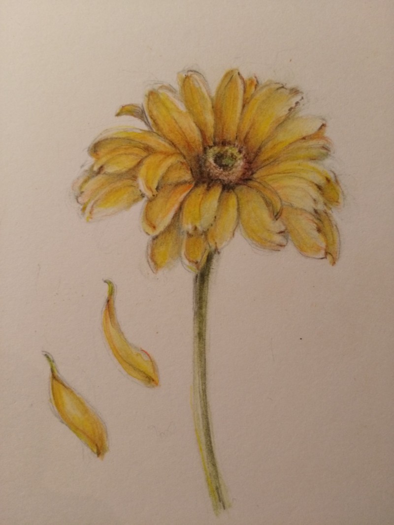
Hoping for some tips on pulling this together, especially centre. Seemed more balanced in original grisaille stage.
Hi Maureen- this is looking really good! There are a couple of areas that could use more toning such as where petals fold over and you also see the undersides. The undersides need some more toning and also the “V” areas where some petals meet could use more toning. One more comment is I would make the stem a little greener. It looks very yellow in the picture. Nice job!
Maureen, this center looks pretty good to me! I know what you mean about sometimes things seem more balanced in the preliminary drawings… Here, it may just be a matter of getting those petals to the left of center to feel more connected to the center. That one beautiful rolling petal on the left almost feels like it’s not connected to the rest of the flower… But overall, I think this is an excellent drawing. Those few more touches that Doug suggested will really finish it off nicely.