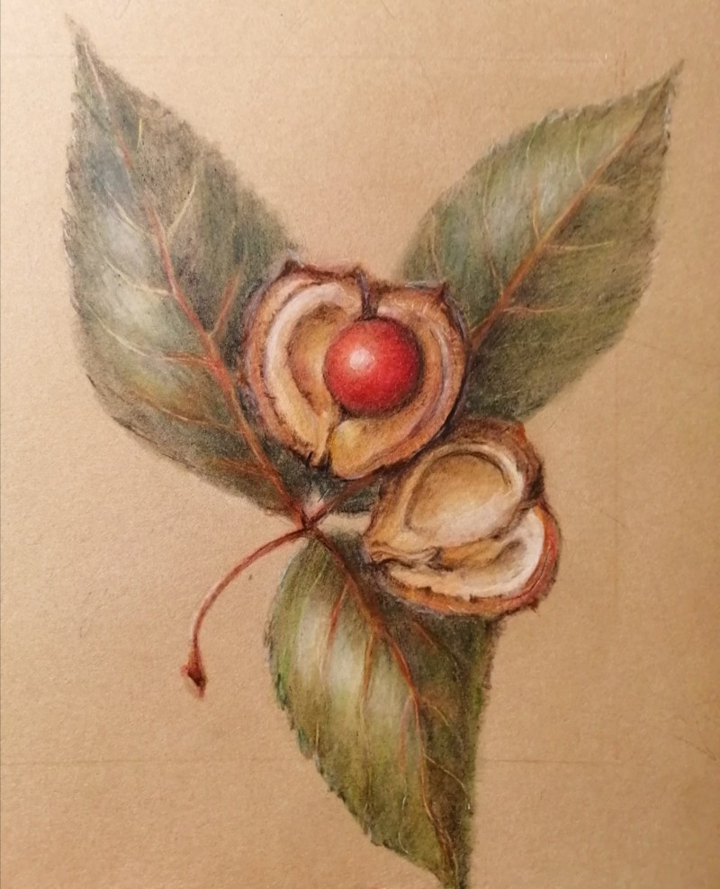
Hi Maureen-I love how the red nut is center stage and nestled in the casing. I think some more dark toning on the leaves in appropriate places would help the two halves of the open nut pop even more! Great job!
Hi Maureen, I love the painterly quality of this piece! I agree with Doug that the edges of the nut need to be more distinct. A bit more shadow should work. Maybe a carefully placed highlight, as well.
This looks great on the Kraft paper, and I love the complimentary colors. The inside of that nut feels so nice and concave, and the red fruit looks like it’s tucked in there and nice and cozy.
I was thinking along the edge of the nut next to where you darken for shadow. Not much. Just a touch to bring your eye forward. And broken up so as not to create an outline.
16 December 2020
Beautiful, Maureen! Love the quality of the green color in these leaves. The one place I see that could use some touch-up darks is on the top left of the upper chestnut, where it overlaps the leaf. I think the leaf underneath there could be a little darker. It looks now like there’s a white halo there; I would just refine it with a sharp dark pencil. Gorgeous work. Love that red nut!!
Hi Maureen-I love how the red nut is center stage and nestled in the casing. I think some more dark toning on the leaves in appropriate places would help the two halves of the open nut pop even more! Great job!
Hi Maureen, I love the painterly quality of this piece! I agree with Doug that the edges of the nut need to be more distinct. A bit more shadow should work. Maybe a carefully placed highlight, as well.
Hi Maureen – I Love how my eye goes to that warm, red nut nestled in the pod. Gorgeous quality to this drawing. I like Katy and Doug’s suggestions.
This looks great on the Kraft paper, and I love the complimentary colors. The inside of that nut feels so nice and concave, and the red fruit looks like it’s tucked in there and nice and cozy.
@doug-milne nice to hear from you, yes I’ll revisit the leaves and edges of nut, hope all is well
@katylyness Hi Katy, Where are you thinking of highlight? Great to get feedback, looking forward to more ideas
I was thinking along the edge of the nut next to where you darken for shadow. Not much. Just a touch to bring your eye forward. And broken up so as not to create an outline.
Beautiful, Maureen! Love the quality of the green color in these leaves. The one place I see that could use some touch-up darks is on the top left of the upper chestnut, where it overlaps the leaf. I think the leaf underneath there could be a little darker. It looks now like there’s a white halo there; I would just refine it with a sharp dark pencil. Gorgeous work. Love that red nut!!
Maureen – not sure if the @ feature was working. I used watercolour and pencil on that chestnut drawing.