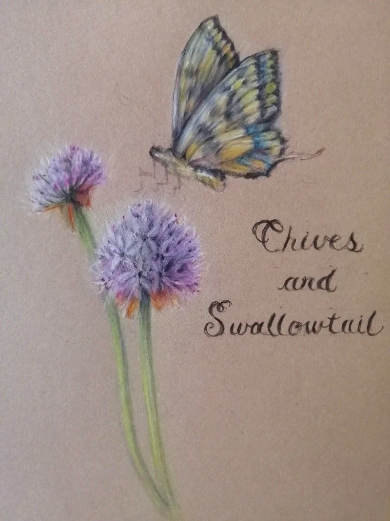
Hi Maureen, So beautiful! I’m a big fan of your soft, almost dreamlike style. And this drawing has such lovely colors. That warm red on the underside of the flowers is such an unexpected choice. It really makes the drawing. I’d like to see a bit of a warm reddish hue in the butterfly. I’d also like to see the stems of the flowers more defined. The top of the one on the left seems too wide. You could keep the softness, but define the edges a bit more.
08 July 2021
This is so sweet, Maureen. Love those butterfly wings! Great bits of dark detail in those chive flowers–a great example of showing us depth with just little touches of very dark.
@katylyness Thanks for your tips, I like how you notice the warm red. It gives me confidence to continue experimenting with unusual tones. Do you suppose it would be possible to do a glaze of some kind over the butterfly? Or maybe just suggestive hints of reds mixed in with the ochre on the wings?
@vern It was a really fun piece to work on, many many layers in the chives! I still need to work on my writing, I think smaller letters might have been better but overall I am pretty happy with it.
Hi Maureen, I’m glad you find my tips useful! As for the reds on the butterfly, I would add hints of red. I don’t think you should change the actual color of the total butterfly, just add a spot of what might be a reflective color. Since botanical illustration aims to be accurate, flights of fancy on color should be somewhat true to reality.

Hi Maureen, So beautiful! I’m a big fan of your soft, almost dreamlike style. And this drawing has such lovely colors. That warm red on the underside of the flowers is such an unexpected choice. It really makes the drawing. I’d like to see a bit of a warm reddish hue in the butterfly. I’d also like to see the stems of the flowers more defined. The top of the one on the left seems too wide. You could keep the softness, but define the edges a bit more.
This is so sweet, Maureen. Love those butterfly wings! Great bits of dark detail in those chive flowers–a great example of showing us depth with just little touches of very dark.
@katylyness Thanks for your tips, I like how you notice the warm red. It gives me confidence to continue experimenting with unusual tones. Do you suppose it would be possible to do a glaze of some kind over the butterfly? Or maybe just suggestive hints of reds mixed in with the ochre on the wings?
@vern It was a really fun piece to work on, many many layers in the chives! I still need to work on my writing, I think smaller letters might have been better but overall I am pretty happy with it.
Hi Maureen, I’m glad you find my tips useful! As for the reds on the butterfly, I would add hints of red. I don’t think you should change the actual color of the total butterfly, just add a spot of what might be a reflective color. Since botanical illustration aims to be accurate, flights of fancy on color should be somewhat true to reality.