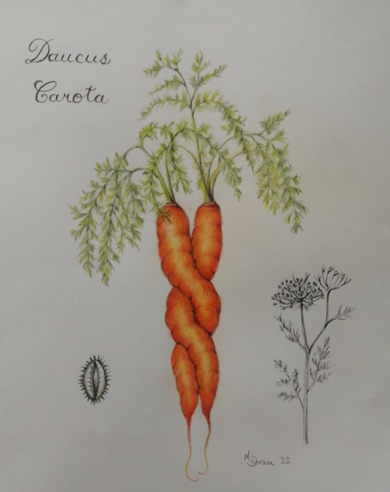
Nice page Maureen! I really like the mix of b/w and color! I think you could go with some more dark toning along the right sides of the carrots to enhance their form and also a couple of areas where they overlap. The highlights seem to mostly go right down the center of the carrots and I would expect the highlight to be a little left of center.
Maureen, What a fun subject, and a beautifully designed composition. I really like the bright colors of the carrots with the grayscale images, and your lettering is beautiful. And what a fun subject!
@doug-milne Yes, a little violet or Italian red might work nicely! Always good to hear from you, thanks Doug!