I did not get the brightness I wanted here. I should have put the white down first I realized after the monthly meeting discussion. It was interesting to see garbanzos on the stem. We bought a little “bouquet” of them at the Farmers market.
Thanks, Susan. I was glad to see how spaced apart they are on the stem! We will soak them and cook them as soon as it’s a little cooler. Heat wave right now!
Susan, thanks for your feedback and looking so closely. I sure wish I’d brought more Kraft paper. Who knew?
05 August 2020
This is so interesting, Sheila! I think the open pod on the bottom is really successful… maybe because you got so nice and dark down there? I find that because Kraft paper is a midtone itself, I not only have to push my light tones a bit further, but the dark tones as well to get good contrast. If I were you, I would add some more dark to the stem and pods to get that same depth as in the open one on the bottom. 🙂
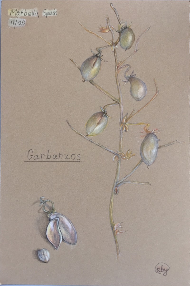
I did not get the brightness I wanted here. I should have put the white down first I realized after the monthly meeting discussion. It was interesting to see garbanzos on the stem. We bought a little “bouquet” of them at the Farmers market.
These are beautiful- very ethereal on the craft paper. Lovely composition of stems and beans. Did you eat them?
Thanks, Susan. I was glad to see how spaced apart they are on the stem! We will soak them and cook them as soon as it’s a little cooler. Heat wave right now!
Looking at them on my bigger computer, the color is beautiful; and the stems are so nice with the color varying in them.
Looking on my bigger computer, the color is so lovely on the pods; and the stems are nicely varied
Looking at this on my bigger computer, the colors of the pods are lovely, good contouring; and the stems are nicely varied
Susan, thanks for your feedback and looking so closely. I sure wish I’d brought more Kraft paper. Who knew?
This is so interesting, Sheila! I think the open pod on the bottom is really successful… maybe because you got so nice and dark down there? I find that because Kraft paper is a midtone itself, I not only have to push my light tones a bit further, but the dark tones as well to get good contrast. If I were you, I would add some more dark to the stem and pods to get that same depth as in the open one on the bottom. 🙂
That’s a good idea, Vern. I’ll try that. I actually got the pods lighter on a second attempt. I’ll post it. Thanks!