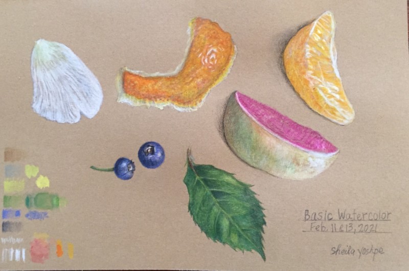
I’ve been liking putting some loose white water-colour down in different trabsparencies and leaving some Kraft paper showing, then building on top of that. I find it really fun to see how much I can let the Kraft paper do the talking. My favs here are your highlight on the rind, and the highlights/ wet glow on the orange slice.
I think it’s always going to be a challenge to build watercolor layers on Kraft–it simply is not a watercolor paper. It seems to me like you got some pretty good bright colors here! It makes sense that you would lose the transparent quality, because the toned paper makes it harder to “see through” the pencil layers; whereas on white paper, “light” (aka white) permeates through the pencil layers to create that translucent quality. ?
That makes sense and it seems odd to leave brown when the petals or whatever are a different color, but like the effect I see people getting with more paper showing.
Well it looks like this was a good workshop!
Thanks, Sam. How do you work to get bright colors on Kraft paper. I tend to loose the translucent quality fast!
I’ve been liking putting some loose white water-colour down in different trabsparencies and leaving some Kraft paper showing, then building on top of that. I find it really fun to see how much I can let the Kraft paper do the talking. My favs here are your highlight on the rind, and the highlights/ wet glow on the orange slice.
Thanks, Sam. I’ll try that with the white watercolor on Kraft. Big challenge for me!
For us all 🙂
I think it’s always going to be a challenge to build watercolor layers on Kraft–it simply is not a watercolor paper. It seems to me like you got some pretty good bright colors here! It makes sense that you would lose the transparent quality, because the toned paper makes it harder to “see through” the pencil layers; whereas on white paper, “light” (aka white) permeates through the pencil layers to create that translucent quality. ?
I love the bright colors. They really pop against the Kraft paper. We are surrounded by grays, browns, and a ton of white here 🙁
That makes sense and it seems odd to leave brown when the petals or whatever are a different color, but like the effect I see people getting with more paper showing.
Thanks, Pam. We’ve got the same palette here. Right now, lots of white!