Oooh. Interesting on the Kraft paper. I think that the Kraft paper makes it more obvious that these are cutouts. I feel like the standards of the iris may need a little more contrast/darks? I don’t know. What do you think?
Thanks for your feedback, Pam. Actually, I’m not happy with my iris and I’ll be reworking the page. My pencil drawing of the iris was a lot better, but I did it on cheap sketch paper.

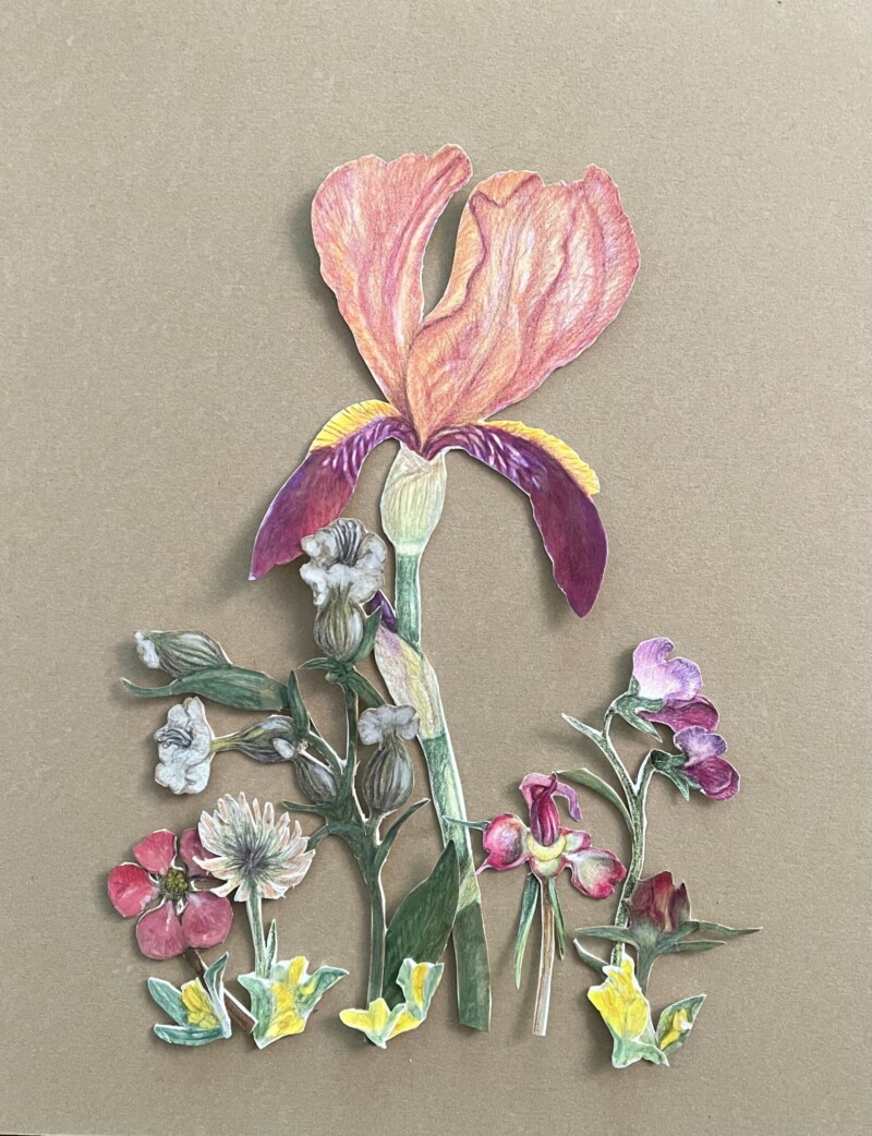
Nice color story Sheila! Maybe consider something for the negative space to the right of the Iris stem.
Oooh. Interesting on the Kraft paper. I think that the Kraft paper makes it more obvious that these are cutouts. I feel like the standards of the iris may need a little more contrast/darks? I don’t know. What do you think?
Thanks, Doug. That’s a good idea. I’m reconfiguring the page.
Thanks for your feedback, Pam. Actually, I’m not happy with my iris and I’ll be reworking the page. My pencil drawing of the iris was a lot better, but I did it on cheap sketch paper.