Hi! This is a fun page! Love the colors and you have good saturation! What I notice on most of them is there is too much dark and mid-range toning. The areas on the left side of each round subject would have light areas surrounding the highlight. I recently posted pages from Wendy’s book concerning toning round objects and they should be good to refer to.
01 April 2020
Yes, nice saturation and good color matching! My advice here is the same: sharp pencil, and ssslllloooowww toning. Build to that saturation level gradually, not all at once. Also try using other grisaille colors besides Dark Sepia, and keep that grisaille layer nice and light. That will help keep the final drawing a bit lighter around the highlight.

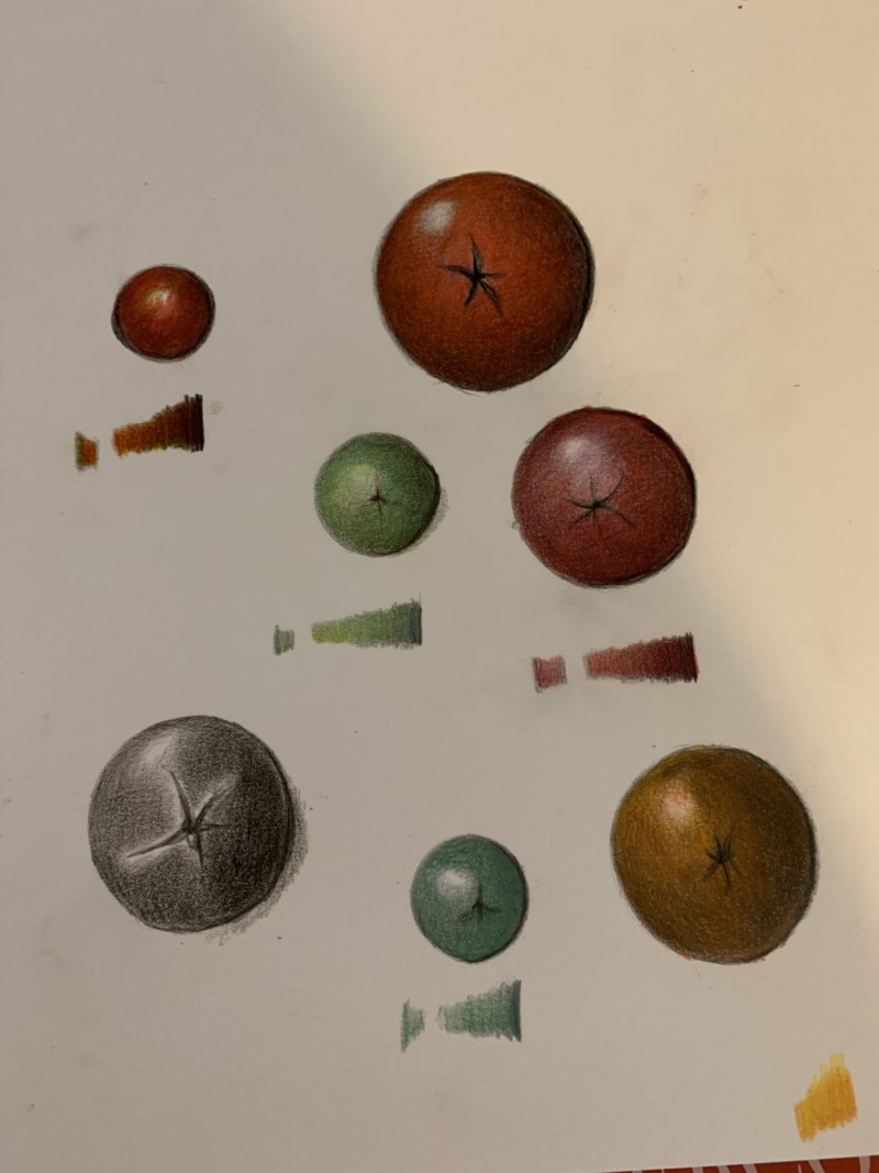
Hi! This is a fun page! Love the colors and you have good saturation! What I notice on most of them is there is too much dark and mid-range toning. The areas on the left side of each round subject would have light areas surrounding the highlight. I recently posted pages from Wendy’s book concerning toning round objects and they should be good to refer to.
Yes, nice saturation and good color matching! My advice here is the same: sharp pencil, and ssslllloooowww toning. Build to that saturation level gradually, not all at once. Also try using other grisaille colors besides Dark Sepia, and keep that grisaille layer nice and light. That will help keep the final drawing a bit lighter around the highlight.
Thank you both. I will slow it down and try again.