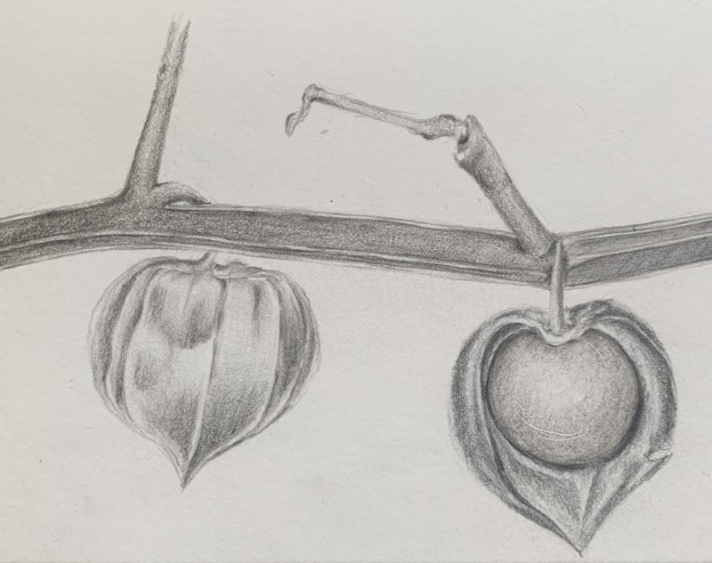
This study was done in dark sepia and graphite (accidentally). Struggled with the highlight many times and ended up scratching the paper with my mono zero. Was trying to make the one on the right look more concave within the casing. Feedback appreciated.
Thanks, Doug. I searched high and low for just the right photograph for these gooseberries. They were a challenge for me to draw but love their paper-like quality. I did not feel I was ready for the veining. But, I will revisit this photo when I learn to create tonal values better.
Thanks for sending the photo! I can see why the subject and this view were so appealing to you! It is tricky when you are using photos taken by someone else. It looks like a flash was used and it has eliminated some of the tones you need to convey in your drawing. What you can see on the fruit is that the highlight on a shiny subject needs to be very white with a fairly sharp edge. I also see in the photo a range of dark and mid-range tones on the right hand side of the fruit which conveys it’s round form. You need to add more of that to your drawing. Some required toning in the other areas is not as easy to see in the photo. To illustrate how the covering is cut away you need to tone along the left edge of cut away and also have highlights on the right side. The intactly covered fruit also needs more toning to show it’s form which is suggested in the photo. This is an instance where you need to tone how you know it should be rather than what the photo is showing you. Think of how round subjects should be toned. I know the rules of toning are not easy at first, but the more you do it the easier it becomes.
This study was done in dark sepia and graphite (accidentally). Struggled with the highlight many times and ended up scratching the paper with my mono zero. Was trying to make the one on the right look more concave within the casing. Feedback appreciated.
It is a really nice rendering! If you still have the subject (or photo) it would help if you could send a photo especially of the one on the right.
Thanks, Doug. I searched high and low for just the right photograph for these gooseberries. They were a challenge for me to draw but love their paper-like quality. I did not feel I was ready for the veining. But, I will revisit this photo when I learn to create tonal values better.
Thanks for sending the photo! I can see why the subject and this view were so appealing to you! It is tricky when you are using photos taken by someone else. It looks like a flash was used and it has eliminated some of the tones you need to convey in your drawing. What you can see on the fruit is that the highlight on a shiny subject needs to be very white with a fairly sharp edge. I also see in the photo a range of dark and mid-range tones on the right hand side of the fruit which conveys it’s round form. You need to add more of that to your drawing. Some required toning in the other areas is not as easy to see in the photo. To illustrate how the covering is cut away you need to tone along the left edge of cut away and also have highlights on the right side. The intactly covered fruit also needs more toning to show it’s form which is suggested in the photo. This is an instance where you need to tone how you know it should be rather than what the photo is showing you. Think of how round subjects should be toned. I know the rules of toning are not easy at first, but the more you do it the easier it becomes.