Welcome to the ArtFeed Sarah! You have been busy and have a great selection of posts! The color of the lemon is nice and bright and it is not easy to capture. There are a couple of things to consider. Be careful to not have the subject be outlined. You don’t want to see the dark outside edges, especially when they are near the light source. You could use more toning to enhance the form of the lemon. For a yellow subject a green or gold are good for toning so the bright yellow color does not get muddy.
Thank you, that answers one of my questions. As a newcomer to this art form, I sometimes wonder when to tone using something like dark sepia, vs, a more similar color like green and gold as you suggested.
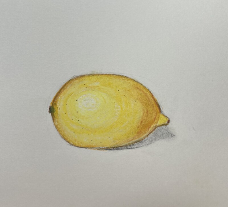