Hi Julie- this is much better! Nice range of smooth toning! I think you could go darker on the right side edge (and be sure to adjust the tones to the left of it if need be). The left edge looks like an outline. The left edge gets to be a 3 or 4 because it is close to the light source. I would add a little more of the tone you have on that left side and transition it to the highlight. I can hear Wendy’s voice in my head about your eclipse shape on the top and bottom edges. Make sure they are nice and neat and the front edges match. Good job!
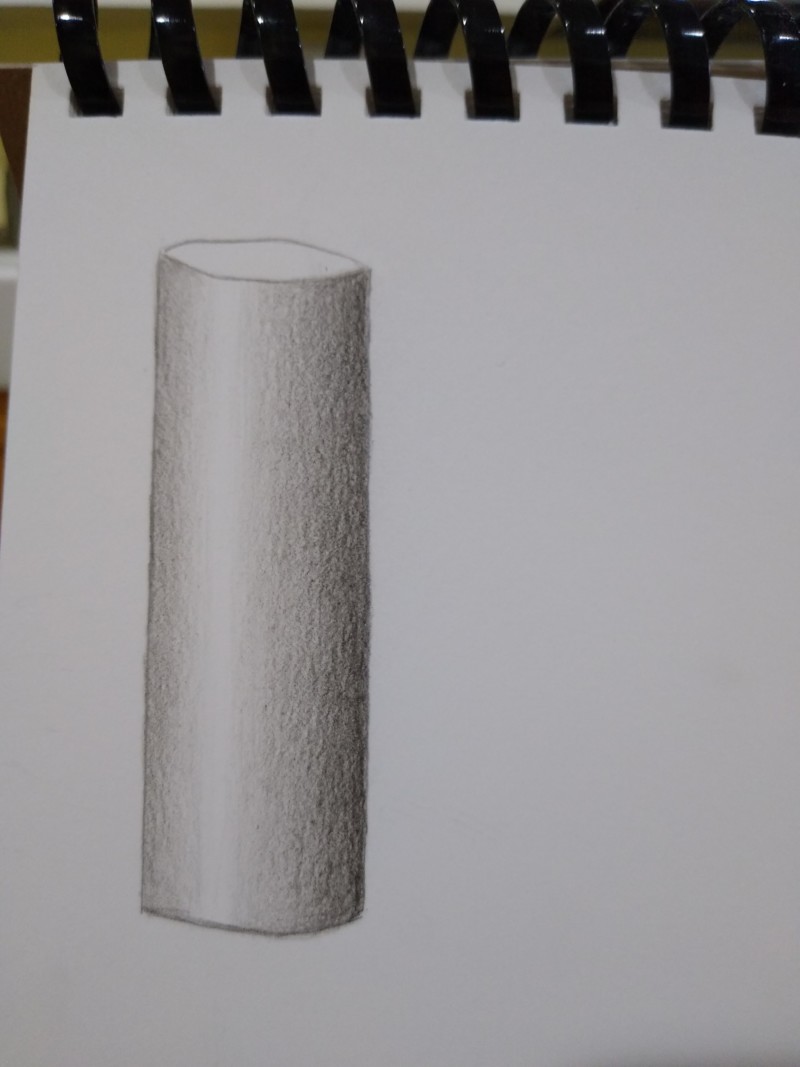
Switched to watercolor paper to see if it made a difference. It does.
Hi Julie- this is much better! Nice range of smooth toning! I think you could go darker on the right side edge (and be sure to adjust the tones to the left of it if need be). The left edge looks like an outline. The left edge gets to be a 3 or 4 because it is close to the light source. I would add a little more of the tone you have on that left side and transition it to the highlight. I can hear Wendy’s voice in my head about your eclipse shape on the top and bottom edges. Make sure they are nice and neat and the front edges match. Good job!