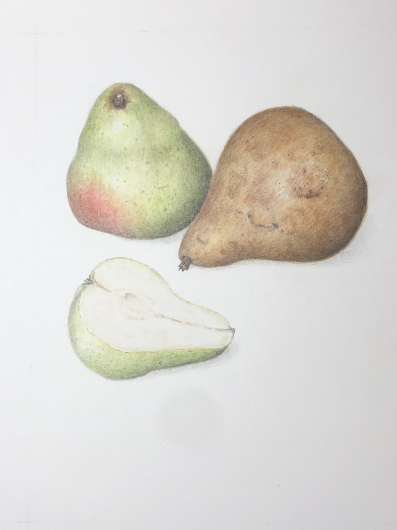
Hi Jane- You have captured the muted colors of these pears and included nice details! I am confused by the highlights as they are different on all three pears. The highlight on the whole green pear is a little too far to the right and I would expect the highlight on the gold pear to be much more to the left. Also take a look at where the two whole pears meet. There is a white line there that distracts your eye. In the future I would have the two pears overlap more so you don’t have the outside edges of two objects meet. For this drawing I would add more dark tone to the right side of the green pear to eliminate the white line.
Hi Jane- You have captured the muted colors of these pears and included nice details! I am confused by the highlights as they are different on all three pears. The highlight on the whole green pear is a little too far to the right and I would expect the highlight on the gold pear to be much more to the left. Also take a look at where the two whole pears meet. There is a white line there that distracts your eye. In the future I would have the two pears overlap more so you don’t have the outside edges of two objects meet. For this drawing I would add more dark tone to the right side of the green pear to eliminate the white line.