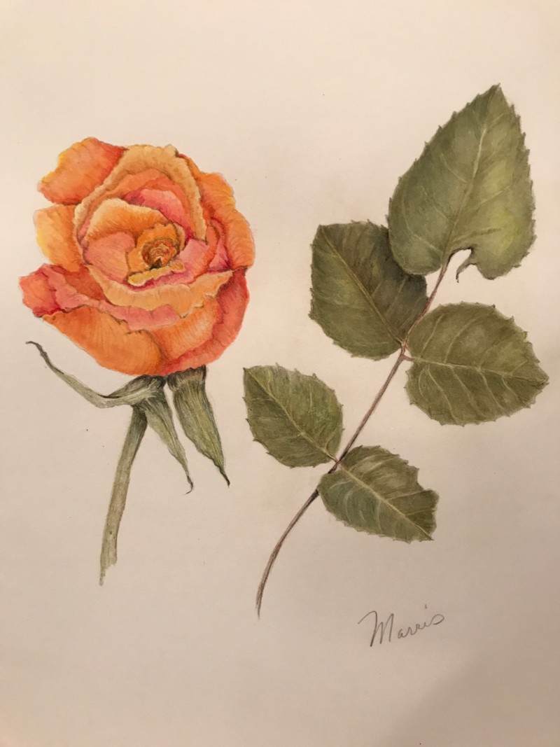
Hi Wendy, Beautiful drawing. I love your use of color in the rose! With the stem and leaves, I think the greens could be a bit more vibrant. (Usually students make leaves and stems too vibrant.) I rather like your muted greens. They really set off the orange of the rose. However, I think rose leaves are a bit less grey. With the rose, as much as I love your colors, I’d like to see more of a sense of light on form. I can see where the highlight is. Those touches are great. Use that more. Also think about the flower as a sphere. That core shadow on the right side needs to be darker.
Thanks so much for your helpful guidance Katy. The rose leaves were too olive and I tried to correct with indigo and juniper. I’ll go in again to try to get better contrast with a mix of dark sepia with a selection of greens in the hope I can change the hue on the leaves. When done, I’ll post for further comment.
The hue does give it a vintage, or Victorian feel, however, which is a neat style effect. Reminds me of some old postcards. I appreciate the range of colours you got in that rose. Maybe I’d like to see the rose stem continue down more?