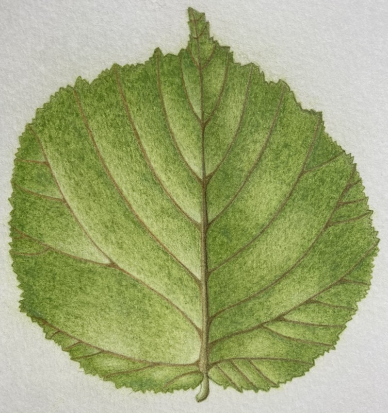
It’s not complete, there is the shadow to do and more veins – I just wondered whether I could have some advice midway. Are the colours okay? Or is the left side too light? I’m not 100% happy with this one, the texture looks funny to me?
Hi Zara- this is a really nice drawing and you are off to a great start! The color is very pleasing! I would point out however that leaves often have a variety of colors to them Various greens, maybe some blue tones or yellow tones. Each leaf is different and the color variety is something to keep in mind. I see a lot of texture and it looks like your paper has some texture to it. Looking at some of your other posts it looks like you are right handed, but this leaf reads that your light source is on the right instead of left. That is fine it just threw me a little bit! If a leaf has a shiny surface then you want a whiter highlight to convey that. More matte finish leaves can have varying degrees of highlight. Currently the highlight on the right side of the leaf is not as strong as your highlights on the left. I would try to make them more consistent either by lightening the highlights on the right side or toning down the highlights on the left. As you say, adding the darker shadow tones will help also. I am looking forward to seeing your progress on this.
@doug-milne thanks so much for your feedback! The light was on the left side but the leaf had loads of different highlights for some reason so I just drew what I saw… interesting to use blue tones, I will give it a go! Thanks again
This is so nice, Zara! Those veins are beautiful, and I think that you are getting some really nice contrast, giving it some good three dimensional form. I think you could add some darker values to push that 3D form even more. Can’t wait to see more!