Activity
-

Machi commented on Machi's Photo 1 week ago
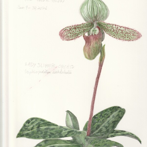
This is homework drawing for a class I am taking at the North Carolina Botanical Garden. It was done after the Orchid drawing on-line workshop with Sam and Pam. What I learned from the orchid workshop really helped me. I had to do this in watercolor. I like the color saturation that the watercolor allows but I had problems with making the dark…[Read more]
-
Machi added a Photo 1 week ago
-
This is homework drawing for a class I am taking at the North Carolina Botanical Garden. It was done after the Orchid drawing on-line workshop with Sam and Pam. What I learned from the orchid workshop really helped me. I had to do this in watercolor. I like the color saturation that the watercolor allows but I had problems with making the dark…[Read more]
-
-

Ishbel Galloway added a Photo 1 week, 3 days ago
-
Ishbel Galloway commented on Ishbel Galloway's Photo 1 week, 3 days ago
Thanks Doug — yes, I’ve had some issues lately but I am finally getting back into drawing!
-
Doug Milne commented on Erin Russek's Photo 1 week, 3 days ago
Nice Erin! The orange (fruit) colors are very good and it has a fresh, juicy quality as you would expect.
-
Doug Milne commented on Ishbel Galloway's Photo 1 week, 3 days ago
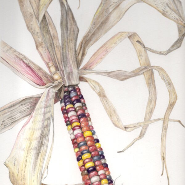
The composition is superb! Love all the twists of the husk and you really captured its dry, papery quality. The ear of corn is equally as wonderful! So crisp and extremely realistic. Enjoying seeing your work again Isabel!
-
Doug Milne commented on Ishbel Galloway's Photo 1 week, 3 days ago
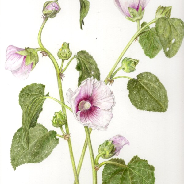
Wow Isabel! Gorgeous! It is beautifully drawn and the details are amazing! You have done a fantastic job with the flowers. They are so fresh and crisp and even though they have a lot of white they really stand out on the white paper. It is hard to look away from that center, front facing flower! Bravo!
-
Ishbel Galloway added a Photo 2 weeks, 1 day ago
-
The composition is superb! Love all the twists of the husk and you really captured its dry, papery quality. The ear of corn is equally as wonderful! So crisp and extremely realistic. Enjoying seeing your work again Isabel!
-
Thanks Doug — yes, I’ve had some issues lately but I am finally getting back into drawing!
-
-
Ishbel Galloway added a Photo 2 weeks, 1 day ago
-
Wow Isabel! Gorgeous! It is beautifully drawn and the details are amazing! You have done a fantastic job with the flowers. They are so fresh and crisp and even though they have a lot of white they really stand out on the white paper. It is hard to look away from that center, front facing flower! Bravo!
-
-
Erin Russek commented on Erin Russek's Photo 3 weeks, 5 days ago
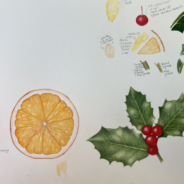
I wanted a little holiday project but I am slow. Here I have added a dried orange slice. My next goal is to combine them.
-
Erin Russek added a Photo 3 weeks, 5 days ago
-
I wanted a little holiday project but I am slow. Here I have added a dried orange slice. My next goal is to combine them.
-
Nice Erin! The orange (fruit) colors are very good and it has a fresh, juicy quality as you would expect.
-
-
Rachel Trachten commented on Rachel Trachten's Photo 1 month, 1 week ago
Many thanks Doug – I appreciate all of these suggestions!
-
Doug Milne commented on Hélène Chiasson's Photo 1 month, 1 week ago
Hi Helene! Happy New Year! This is a wonderful drawing of a great subject!. I think what you need to do to anchor these objects is to add shadows. I see a couple of hints of shadowing, but you need to commit to it and that will convey that they are lying on a sandy shore.
-
Doug Milne commented on Rachel Trachten's Photo 1 month, 1 week ago
Hi Rachel! Your fruits are well rendered and the colors are very good! I would say that judging from the highlights and the cast shadows that your light was directly over the fruits. The botanical standard for lighting is that if you are right handed, the light comes over your left shoulder at a 45 degree angle. If you are left handed the light…[Read more]
-
Hélène Chiasson commented on Hélène Chiasson's Photo 1 month, 1 week ago
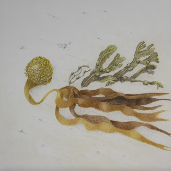
I wanted to add an anchor to the previous drawing of Laminaria algae. So I added streaks and tiny rocks to represent the sand on which the algae laid. It is tough to get this right! Any suggestions?
-
Hélène Chiasson added a Photo 1 month, 1 week ago
-
I wanted to add an anchor to the previous drawing of Laminaria algae. So I added streaks and tiny rocks to represent the sand on which the algae laid. It is tough to get this right! Any suggestions?
-
Hi Helene! Happy New Year! This is a wonderful drawing of a great subject!. I think what you need to do to anchor these objects is to add shadows. I see a couple of hints of shadowing, but you need to commit to it and that will convey that they are lying on a sandy shore.
-
-
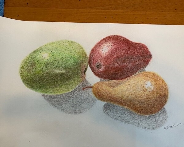
Rachel Trachten commented on Rachel Trachten's Photo 1 month, 1 week ago
I’d welcome any feedback or suggestions. Thanks!
-
Rachel Trachten added a Photo 1 month, 1 week ago
-
I’d welcome any feedback or suggestions. Thanks!
-
Hi Rachel! Your fruits are well rendered and the colors are very good! I would say that judging from the highlights and the cast shadows that your light was directly over the fruits. The botanical standard for lighting is that if you are right handed, the light comes over your left shoulder at a 45 degree angle. If you are left handed the light…[Read more]
-
Many thanks Doug – I appreciate all of these suggestions!
-
-
Doug Milne commented on Machi's Photo 1 month, 2 weeks ago
Hi Machi! Happy Holidays to you and your family! You are so smart to do the black and white image. It is a great tool to help with getting tones correct and also see where you need more contrast. It is a beautiful drawing and I think the changes you made have helped a lot! The work you did on the leaves has given depth to the branch structure and…[Read more]
-
Doug Milne commented on Erin Russek's Photo 1 month, 2 weeks ago
Happy holidays to you and yours!
- Load More