Activity
-

Hélène Chiasson commented on Hélène Chiasson's Photo 4 days, 6 hours ago
This flower and these leaves sprouted from a severely pruned bush. To show how nature comes back despite hardship.
-
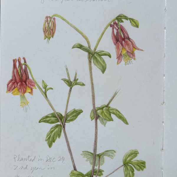
Hélène Chiasson added a Photo 4 days, 6 hours ago
-
This flower and these leaves sprouted from a severely pruned bush. To show how nature comes back despite hardship.
-
-
Doug Milne commented on Machi's Photo 5 days, 18 hours ago
One of my favorite plants! You really achieved the colors and getting wonderful form on all the various parts of the flower.
-
Doug Milne commented on Machi's Photo 5 days, 18 hours ago
The flower color seems spot on!
-
Doug Milne commented on Machi's Photo 5 days, 18 hours ago
Wonderful study Machi. I would think of adding some shading to the top cluster of flowers to give them individual definition.
-
Doug Milne commented on Machi's Photo 5 days, 18 hours ago
Beautiful delicate colors Machi. Great study!
-
Doug Milne commented on Hélène Chiasson's Photo 5 days, 18 hours ago
I think darkening the stems made the flowers stand out more. Beautiful!
-
Hélène Chiasson added a Photo 1 week, 1 day ago
-
I think darkening the stems made the flowers stand out more. Beautiful!
-
-
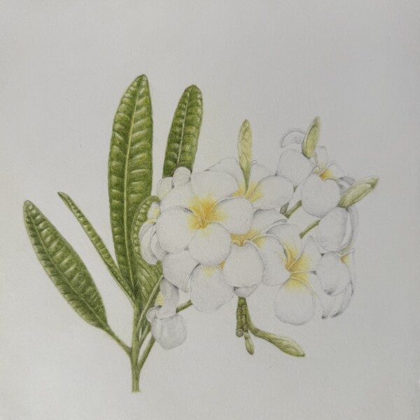
Machi added a Photo 2 weeks, 4 days ago
-
Beautiful delicate colors Machi. Great study!
-
-
Machi added a Photo 2 weeks, 4 days ago
-
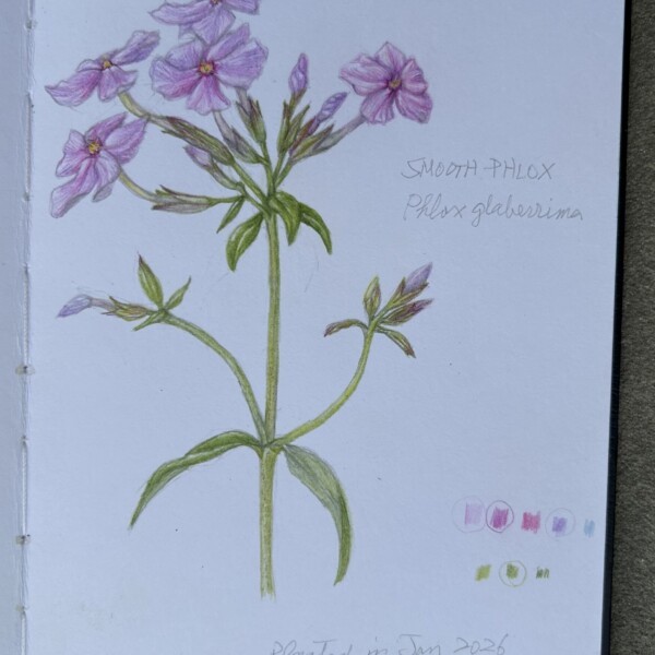
Wonderful study Machi. I would think of adding some shading to the top cluster of flowers to give them individual definition.
-
-
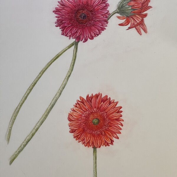
Machi added a Photo 2 weeks, 4 days ago
-
The flower color seems spot on!
-
-
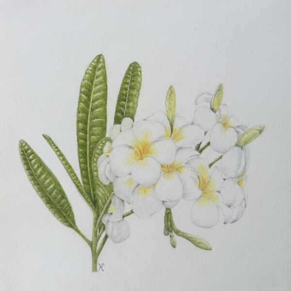
Machi added a Photo 2 weeks, 4 days ago
-
One of my favorite plants! You really achieved the colors and getting wonderful form on all the various parts of the flower.
-
-
Doug Milne commented on Hélène Chiasson's Photo 2 weeks, 5 days ago
Beautifully drawn Helene! I would consider darkening the shadows on the stems we see glimpses of. I would expect the shadows to be a little deeper and it would also make the flowers stand out more.
-
Doug Milne commented on Rita Haft's Photo 2 weeks, 5 days ago
Beautifully drawn Rita. They are not easy flowers to get right. Once again your color selection and saturation are wonderful!
-
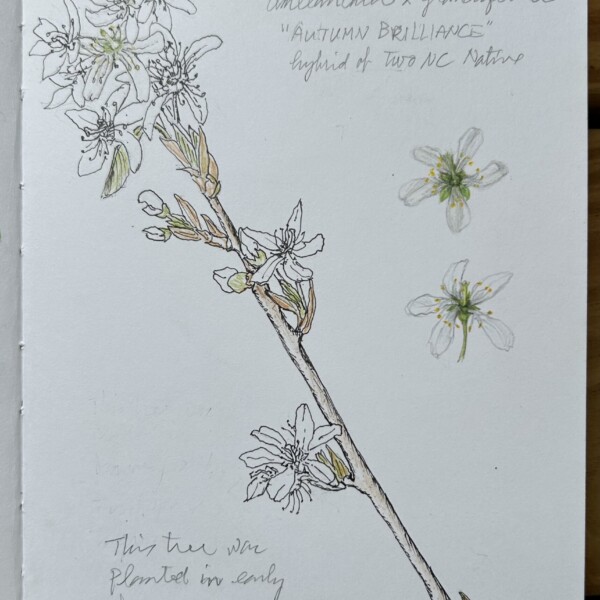
Hélène Chiasson added a Photo 3 weeks, 2 days ago
-
Beautifully drawn Helene! I would consider darkening the shadows on the stems we see glimpses of. I would expect the shadows to be a little deeper and it would also make the flowers stand out more.
-
-
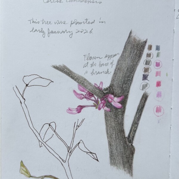
Rita Haft added a Photo 3 weeks, 5 days ago
-
Beautifully drawn Rita. They are not easy flowers to get right. Once again your color selection and saturation are wonderful!
-
-
Margaret Hahn commented on Margaret Hahn's Photo 4 weeks, 1 day ago
I must say, I do like how this drawing turned out – in large part due to Pam’s workshop and recommendations.
-
Margaret Hahn commented on Margaret Hahn's Photo 4 weeks, 1 day ago
🙏
-
Margaret Hahn commented on Margaret Hahn's Photo 4 weeks, 1 day ago
That’s so meaningful coming from you, Doug. Thanks for the encouragement.
-
Margaret Hahn commented on Margaret Hahn's Photo 4 weeks, 1 day ago
Oh how I wish! But this May is impossible for me. Hoping there is a 2028!
- Load More