Activity
-

Sam McWilliams commented on Karen Minden's Photo 2 years, 7 months ago
Way to go Karen!
-
Sam McWilliams commented on Becky Bruno's Photo 2 years, 7 months ago
Great! Way to work those white highlights! Gorgeous drawing
-
Sam McWilliams commented on Becky Bruno's Photo 2 years, 7 months ago
Beautiful, Becky. Good suggestions from the team – also – is the stem really that straight? And does it widen as it connects with the flower? At the terminus of the stem, where you’ve cut it off – it can look nice to let one line drop a little lower than the other – so you have a touch of a diagonal cut off rather than straight. Let’s our eye…[Read more]
-

Pam commented on Becky Bruno's Photo 2 years, 7 months ago
Becky, I’m loving this. You may be able to make that leaf look a bit less fuzzy by going over it with a glaze of watercolor to fill in some of those tiny white dots where the paper is showing through.
-
Pam commented on Becky Bruno's Photo 2 years, 7 months ago
Wonderful!!!!.
-
Pam commented on Becky Bruno's Photo 2 years, 7 months ago
Becky, You did a great job. Those colors are gorgeous. And your shadow colors are really nice. There’s something funky going on the bottom of the pear toward the right side. Do you have a photo of the pear from this point of view? Maybe we could help that area a bit if we could see what that looks like. But, I’m guessing that what is making it…[Read more]
-
Pam commented on Susan Wright's Photo 2 years, 7 months ago
Fantastic petal study! It took me a bit to figure out which were the drawings and which were the real petals! I especially like that light purple petal to the left of the red one. It’s so shimmery. And Your veining looks amazing!
-
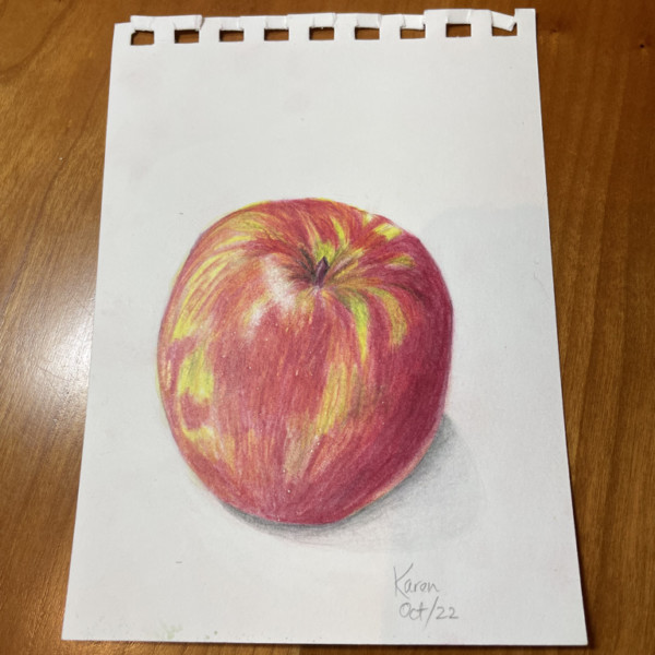
Pam commented on Karen Minden's Photo 2 years, 7 months ago
Oh my goodness! I didn’t see this before I commented on your earlier version, lol. This is great!!! Those changes made a huge difference. You even adjusted your cast shadow! Wonderful job, Karen. Yay.
-
Pam commented on Karen Minden's Photo 2 years, 7 months ago
Lovely Karen! I would just feather some of the red into some of those larger green shapes to break them up a little bit. You may also want to try mixing a little yellow ochre and cream into those green areas to just dull them down little bit. And then maybe a add a glaze of yellow watercolor on top of the whole apple, except for where the white…[Read more]
-
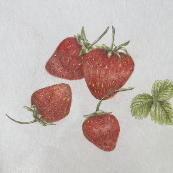
Pam commented on Hélène Chiasson's Photo 2 years, 7 months ago
Nice strawberries, Helene! It’s a really nice drawing. You did a great job with those sepals at the tops of your berries. They have a nice range of values, and lovely curves. I think you can get more values into your berries. Do you think you can get the main highlight back? – especially in that largest berry. I would love to see a nice bright…[Read more]
-
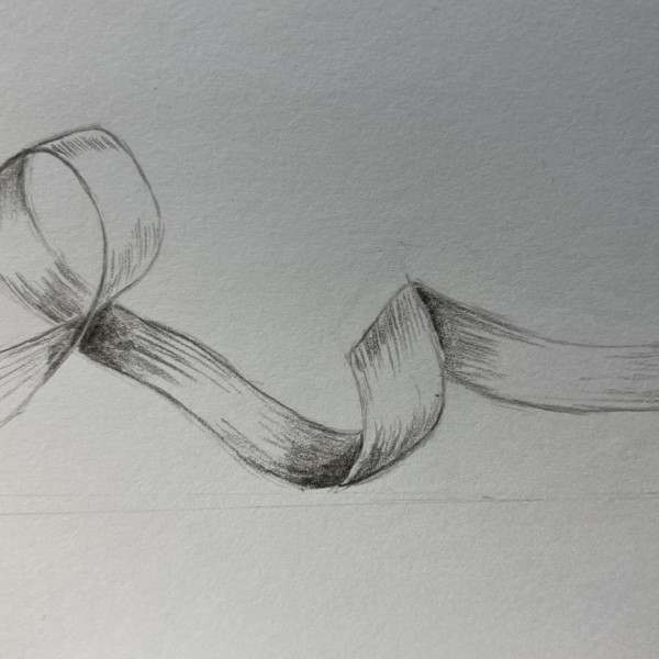
Pam commented on Susan Wright's Photo 2 years, 7 months ago
Beautiful, Susan! Just be careful that you don’t make the tangent lines curved. The lowest tangent line on that right-side curl is looking a little curved. Our brains want it to be curved, but it should actually be straight. See if that is what you are seeing when you observe your ribbon. But gorgeous drawing, Susan. I really like the loose hatching.
-
Pam commented on Hélène Chiasson's Photo 2 years, 7 months ago
This is off to a great start Helene! It’s a beautiful drawing. And you have the right idea about adding your shadow areas in very slowly. It’s looking nice and vibrant, and not dirty at all. Wendy’s “Botanical Botanical Drawing in Color” book has a good explanation for toning lighter-colored subjects on pages 136-137 if you have that book.…[Read more]
-

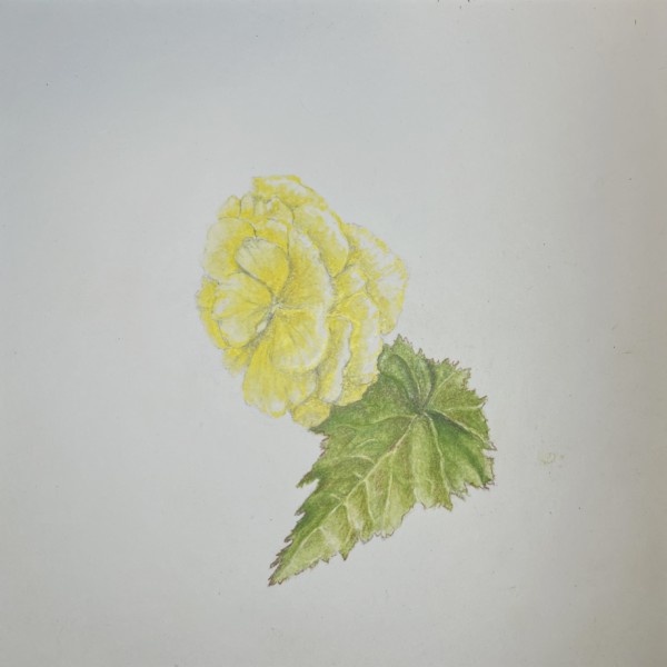
Hélène Chiasson commented on Hélène Chiasson's Photo 2 years, 7 months ago
How does one continue highlighting a pale flower without making it too dirty? Thank you !
-
Hélène Chiasson added a Photo 2 years, 7 months ago
-
How does one continue highlighting a pale flower without making it too dirty? Thank you !
-
This is off to a great start Helene! It’s a beautiful drawing. And you have the right idea about adding your shadow areas in very slowly. It’s looking nice and vibrant, and not dirty at all. Wendy’s “Botanical Botanical Drawing in Color” book has a good explanation for toning lighter-colored subjects on pages 136-137 if you have that book.…[Read more]
-
Also, f you push some greens darker on the leaf where it goes behind the flower it will make the paler yellows pop forward. Look for the areas where you can show contrast.
-
-
Susan Wright added a Photo 2 years, 7 months ago
-
Beautiful, Susan! Just be careful that you don’t make the tangent lines curved. The lowest tangent line on that right-side curl is looking a little curved. Our brains want it to be curved, but it should actually be straight. See if that is what you are seeing when you observe your ribbon. But gorgeous drawing, Susan. I really like the loose hatching.
-
Susan – this drawing has a great quality of movement! Really fun to engage with.
-
-
Hélène Chiasson commented on Hélène Chiasson's Photo 2 years, 7 months ago
Hi Doug. Thank you for your comment. You are correct, the lighting on that first photo was not very good. The light source came from the top, i.e. ambient light.I will work on your suggestions.
-
Hélène Chiasson added a Photo 2 years, 7 months ago
-
Hi Doug. Thank you for your comment. You are correct, the lighting on that first photo was not very good. The light source came from the top, i.e. ambient light.I will work on your suggestions.
-
Nice strawberries, Helene! It’s a really nice drawing. You did a great job with those sepals at the tops of your berries. They have a nice range of values, and lovely curves. I think you can get more values into your berries. Do you think you can get the main highlight back? – especially in that largest berry. I would love to see a nice bright…[Read more]
-
-
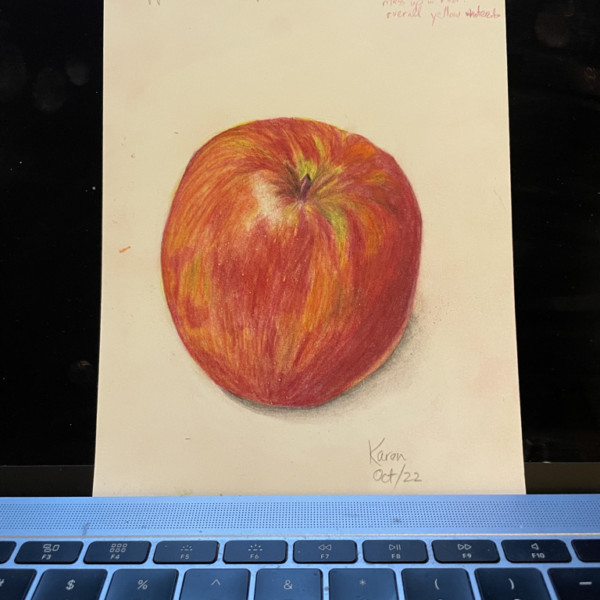
Karen Minden commented on Karen Minden's Photo 2 years, 7 months ago
Thank you Pam and Sam. What a difference in this drawing!
-
Karen Minden added a Photo 2 years, 7 months ago
-
Lovely Karen! I would just feather some of the red into some of those larger green shapes to break them up a little bit. You may also want to try mixing a little yellow ochre and cream into those green areas to just dull them down little bit. And then maybe a add a glaze of yellow watercolor on top of the whole apple, except for where the white…[Read more]
-
-
-
Thank you Pam and Sam. What a difference in this drawing!
-
Oh my goodness! I didn’t see this before I commented on your earlier version, lol. This is great!!! Those changes made a huge difference. You even adjusted your cast shadow! Wonderful job, Karen. Yay.
-
Way to go Karen!
-
- Load More