Activity
-

Pam commented on Richard A stjean's Photo 2 years, 8 months ago
Richard, you are really good at getting bright saturated colors. I’m a little confused by the orange color of the reflected highlight. Is it sitting on an orange surface maybe?
-
Pam commented on Richard A stjean's Photo 2 years, 8 months ago
Richard, I really like the bright graphic quality of your drawings. And you are getting a nice core shadow here. I’m seeing a dark outline around your pepper and around your highlight. You may want to try to fade your colors into your edges instead of outlining shapes. Your toning is getting better with each drawing. Keep it up 🙂
-

Maureen Clare Murphy commented on Maureen Clare Murphy's Photo 2 years, 8 months ago
I plan on adding more to this at some point.
-
Maureen Clare Murphy commented on Maureen Clare Murphy's Photo 2 years, 8 months ago
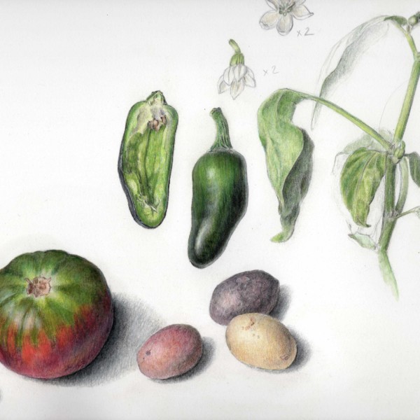
Pam and Wendy looked like they were having so much fun with nightshades so I started a study of my own. I started this while I was stuck at home with COVID in August, I’m not happy with the tomato. I think I did better with the pepper. And apologies for the awkward crop — this is on 11×14 paper and I have a 9×12 scanner.
-
Maureen Clare Murphy added a Photo 2 years, 8 months ago
-
Pam and Wendy looked like they were having so much fun with nightshades so I started a study of my own. I started this while I was stuck at home with COVID in August, I’m not happy with the tomato. I think I did better with the pepper. And apologies for the awkward crop — this is on 11×14 paper and I have a 9×12 scanner.
-
I plan on adding more to this at some point.
-
This is great Maureen!!! Those peppers are amazing! I think your tomato is lovely too. I’m looking forward to watching you add in more elements. Fantastic!
-

I love this Maureen and I think your tomato is awesome! What don’t you like about it?
-
Thank you, @pgthompson and @wendy! As for the tomato, I think the texture is off. It looks almost fuzzy instead of smooth. I’ll bring it (the drawing, not the tomato) with me to the workshop.
-
Great idea, Maureen. See you then.
-
This is just lovely!
-
Really nice page!
-
-
-
Pam commented on Susan Wright's Photo 2 years, 8 months ago
Great!
-
Cathie Hunter commented on Cathie Hunter's Photo 2 years, 8 months ago
thank you Doug
-
Susan Wright commented on Susan Wright's Photo 2 years, 8 months ago
Thank you Doug – I agree with all your suggestions – the highlight area needs to more gradual and the reflective highlight is awkward. Good things to practice…..
-
Doug Milne commented on Cathie Hunter's Photo 2 years, 8 months ago
Hi Cathie- I feel your frustration in your post! The revised color looks really good to me! I think purples are hard to do because there rarely is one purple that works on its own. You have to mix a few colors to get the right one. I see that you followed Pam’s advice and the form is better now too! Don’t get too discouraged, your work just kee…[Read more]
-
Doug Milne commented on Susan Wright's Photo 2 years, 8 months ago
Nice job Susan! You have a really good range of tones on the two spheres. I would lighten the area around the main highlight a little. There is too much of a jump from the highlight to the area surrounding it. The tomato also looks really good! The top area especially has really good form. I would add more dark and mid-range tones (use your…[Read more]
-
Marie Nault commented on Marie Nault's Photo 2 years, 8 months ago
Aw, thank you Doug! I wouldn’t have dared to try it without your encouragement.😊
-
Doug Milne commented on Marie Nault's Photo 2 years, 8 months ago
Hi Marie- I am glad you took the leap and added more color saturation! It looks great!!! You retained the highlight and tonal range, which is imperative, but not always easy when you are adding saturation. Wonderful job!!!!
-
Marie Nault commented on Marie Nault's Photo 2 years, 8 months ago
I tried to intensify the colours all over… I’m wondering if I might have lost a bit of definition and form?
-
Doug Milne commented on Ishbel Galloway's Photo 2 years, 8 months ago
Outstanding Ishbel!!!! Bravo!!!!
-
-
I tried to intensify the colours all over… I’m wondering if I might have lost a bit of definition and form?
-
Hi Marie- I am glad you took the leap and added more color saturation! It looks great!!! You retained the highlight and tonal range, which is imperative, but not always easy when you are adding saturation. Wonderful job!!!!
-
Aw, thank you Doug! I wouldn’t have dared to try it without your encouragement.😊
-
Yes!!!! I think you are keeping the form very nicely. And I love how saturated you got. Great!
-
Pam, thank you so much for your motivating feedback! I feel I’ve got some great coaching from you, to help me reach my goals!
-
-

Ishbel Galloway commented on Ishbel Galloway's Photo 2 years, 8 months ago
Thank you so much!
-
Maureen Clare Murphy commented on Renata's Photo 2 years, 8 months ago
Beautiful landscape, Renata!
-
Maureen Clare Murphy commented on Ishbel Galloway's Photo 2 years, 8 months ago
I love this — it’s so elegant and striking on the toned paper
-
Susan Wright commented on Susan Wright's Photo 2 years, 8 months ago
Thank you Doug!
-
Susan Wright commented on Ishbel Galloway's Photo 2 years, 8 months ago
these are amazing – beautiful composition
- Load More