Activity
-

Susan Wright commented on Renata's Photo 3 years ago
The fuzz is very well done.
-

sheila y. commented on Ishbel Galloway's Photo 3 years ago
This is gorgeous! The whites are so great. Everything!!
-
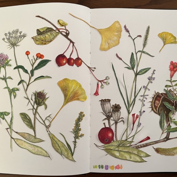
sheila y. added a Photo 3 years ago
-
This is amazing. I love the composition.
-

This is another gorgeous drawing, Sheila. There is one area that is bothering me a bit. There is a spot on the bottom right of the left page where the bottom of the queen ann’s lace, the petiole of the Ginkgo leaf, and the seed pods meet. Maybe you could consider making that queen anne’s lace stem a little longer, so that they don’t all converge…[Read more]
-
Hi Sheila- the placement of the pieces really moves my eye around the page. Beautiful!!!
-

Totally beautiful as usual. I really want to see these in a gallery show !!
-
So beautiful and fun!
-
Thanks, Susan. It was fun to keep working on.
-
Pam, thanks for the specific question. I see what you mean. I’ll see what I can do.
-
Thanks, Doug!
-
Thanks, Sam. That would be fun!
-
Thanks, Renata.
-
-
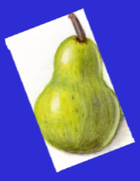
Richard A stjean added a Photo 3 years ago
-
Nice Richard! These colors are looking great, and you’ve gotten really nice 3D form. Wonderful! You could think about maybe toning down the highlight that’s on the top of the pear just a bit so that those two main highlights don’t look so similar. Great job, RIchard.
-
-
Richard A stjean added a Photo 3 years ago
-
Loving watching you go through these lessons, Richard! I really like how your toning is starting to get smoother. Are you noticing that when you use lighter pressure on your pencil for your toning that you get softer, smoother gradients?
-
-
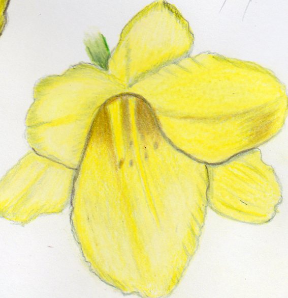
Doug Milne commented on Richard A stjean's Photo 3 years ago
Nice, bright colors Richard! The dark outline is throwing me and I would not expect to see it especially on a light colored subject. You could add more range of tones to convey the shadows that would exist from the light source coming from the left at a 45 degree angle. That would help express the depth of the center well and give the whole flower form.
-
Renata commented on Wendy Kleinman's Photo 3 years ago
I love the colours!
-
Doug Milne commented on Renata's Photo 3 years ago
Nice job Renata! The colors seem spot on and the fuzz is very convincing! Thanks also for your comments!
-
Doug Milne commented on Wendy Kleinman's Photo 3 years ago
The colors are beautiful Wendy! It has a great range of tones, which give this nice form. I feel like I would like to see a main highlight. What do you think?
-
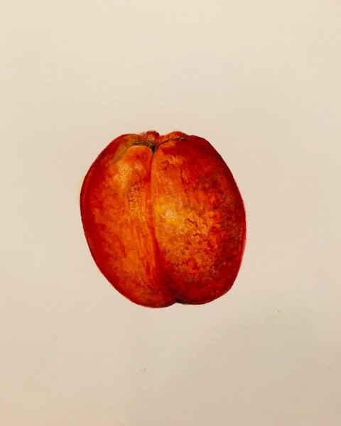
Wendy Kleinman added a Photo 3 years ago
-
The colors are beautiful Wendy! It has a great range of tones, which give this nice form. I feel like I would like to see a main highlight. What do you think?
-
I love the colours!
-
Wendy, this texture and form is great! I’m with Doug on the highlight. It’s so hard with something that’s as matte as a peach. It doesn’t really have much of a highlight when we look at it. But to help to create that 3 dimensional illusion we sometimes have to exaggerate the highlight just a bit. You wouldn’t want to make the highlight the white…[Read more]
-
-
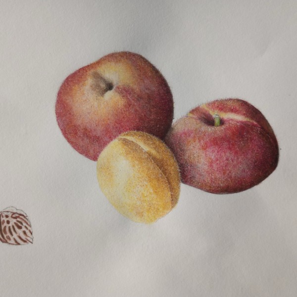
Renata commented on Renata's Photo 3 years ago
I think they are so fuzzy that they look furry but the paper is not accepting anything anymore. Haven’t worked on the stone yet.
PS: thanks for the instructions in the intro to the Art Feed, Very helpful! I do ALWAYS want you guys to be critical and constructive. I appreciate the comments! -
Renata added a Photo 3 years ago
-
I think they are so fuzzy that they look furry but the paper is not accepting anything anymore. Haven’t worked on the stone yet. PS: thanks for the instructions in the intro to the Art Feed, Very helpful! I do ALWAYS want you guys to be critical and constructive. I appreciate the comments!
-
Nice job Renata! The colors seem spot on and the fuzz is very convincing! Thanks also for your comments!
-
The fuzz is very well done.
-
Renata, Those peaches are looking sooooo fuzzy! You really nailed that texture- makes me want to go back and work some more on my peach drawing to get it more fuzzy. This is such a lovely comparison of different varieties of peaches as well. The only thing that is throwing me a bit is how far away that pit is from the peaches. It keeps pulling my…[Read more]
-
Thank you everyone! Pam, I totally agree with you – the pit is very far away, not sure why I did that. Maybe I was hoping to add some leaves between the fruit and the pit but I don’t have access to a peach tree. Is it okay if I try to do something based on the ones you showed in the workshop?
-
Sure! Although it’s best to work from life, sometimes you have to use photos.
-
-
Richard A stjean added a Photo 3 years ago
-
Nice, bright colors Richard! The dark outline is throwing me and I would not expect to see it especially on a light colored subject. You could add more range of tones to convey the shadows that would exist from the light source coming from the left at a 45 degree angle. That would help express the depth of the center well and give the whole flower form.
-
Richard, I love how you are getting nice and dark inside the throat of this flower, it really helps to show that depth. Keep these fun drawings coming 🙂
-
-
Maureen Clare Murphy commented on Maureen Clare Murphy's Photo 3 years ago
-
Pam commented on Susan Wright's Photo 3 years ago
Nice Susan! You really captured the feel of the tomato skin on these. Lovely.
-
Pam commented on Becky Bruno's Photo 3 years ago
115! Yikes. Really lovely. It’s a beautiful composition, and you did a great job getting nice and saturated with the colored. I love those shiny seeds in the lower right corner. The secondary veins on your leaves seem a little too uniform and a little too wide to me. You may want to go in, and make those veins wiggle a little, and narrow them up a…[Read more]
-
Renata commented on Maureen Clare Murphy's Photo 3 years ago
Really nice page!
-
Renata commented on Renata's Photo 3 years ago
Thank you, ladies!!
-
Renata commented on Sam McWilliams's Photo 3 years ago
Ooooh, Sam! This is gorgeous! May I please have a slice?
-
Becky Bruno commented on Ishbel Galloway's Photo 3 years ago
I love this – Beautiful!
- Load More